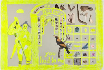
If it’s 10.30am or 3pm it’s time for coffee. Skinny flat white. Lunch is between 12.30 and 1.30pm. A salad if at home, a Regular Bondi Burger, fries and Mountain Dew to drink if we’re out. Knock-off time is 5.30pm. Simpsons at 6pm – and again at 8pm – the news in between. We like a little bit of routine, markers in the day that let us know where we are and what we’re doing. We haven’t quite got to the point of having a wardrobe full of the same style and coloured clothes, or locking and unlocking the door an even number of times before we go out, or brushing our teeth downwards as many times as upwards, but it’s always a possibility. When it comes to art galleries, there are the ones we know are going to be a pay off no matter what, and if they don’t, there’s a number of practical considerations to take into account anyway. All that aside, however, it had played on our minds that the cow track of our incessant art gallery wanderings was a well known route. We needed to get out of the comfort zone and see some galleries and artists we’d never seen before.
After The Winter is an exhibition at the mysteriously named Horus & Deloris Contemporary Art Space. It’s a well known fact that Horus was the Egyptian God of the Sky, but a lesser known fact that Deloris was the Sumerian God of the catalogue essay [spreading havoc and random parenthesis among the wicked] and taking such a name for your gallery is certainly tempting the gods. Located in Pyrmont at 102 Pyrmont Street, the gallery is in an otherwise vacant building with a sign outside advising that there is art “inside”. You need to press a buzzer to get in and even when you walk in the door, the woman who runs the place seems completely surprised that you’ve come for a visit. How did you know about us? she asks. The ad in Art Almanac. It turns out she’s been absorbed in playing Warcraft so no wonder the real world seems a bit strange.
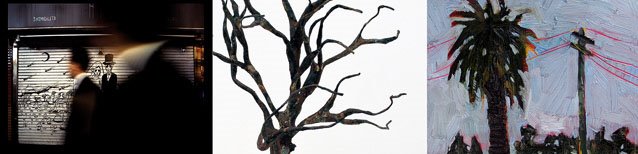
[left to right]: Wendy Shaw Skulls, Adam Laerkesen Windchasers (detail),
Martin McEwen Last Light’
The H&D exhibition features work by three artists – Adam Laerkesen who makes small scale sculptures, Martin McEwen who is a painter and Wendy Shaw, a photographer. It was Laerkesen’s sculptures that initially caught our eye, a big image of his work featuring in the full page gallery ad in Art Almanac. Using cast resin, the artist has created a little figure with a vaguely Asian look in a standard bearer pose, repeated 11 times, holding up various found objects from plant fronds to rusted metal and a plastic bag. Repetition always looks great – anything in threes or more creates a nice symmetry – and Laerkesen’s works has a cartoonish Terracotta Warrior-esque feel. The dominant artist in the show however is McEwan, who has 17 oil on paper paintings of Sydney scenes – red brick flats in Bondi, palm trees, telegraph poles and skies at dusk – and a series of dancing bodies. The landscape paintings are more than reasonable images, the artist having a very nice technique of underpainting and scratching back. Nothing fancy mind, a bit like spiritual meat and potatoes. Shaw’s photographs are all night scenes and she’s clearly influenced by Bill Henson, but going a bit further into darkness to the point of virtual invisibility in a work called Red Car, Kings Cross. Printed on silk, the three images are very tactile and if you could buy them as printed pyjamas, she might be on to something.
Another group show is Teasers: Mid Year Group Show at Groundfloor Gallery in Balmain. Known to locals and visitors alike as the “insular peninsula” we were mindful of the need to keep our visit to Balmain brief lest the siren song of cafes, semi-hippy homeware stores and Zen chiropractors keep us forever. The star of the Teasers is Ilya Volykhine, an artist with a profile thanks to placings in various competitions including the Blake and the Archibald. With works in the window, and several large canvases in the gallery, everything else feels additional to the artist’s well worked collage/paintings. Volykhine is unafraid of brown, a colour that has been known to send lesser artists into a state of terror and shock, nor is the artist concerned with mixing it with black and turps to give it a smeary, streaky, gestural stain. In a similar state of tonal fearlessness Timothy Preston has a work called Mortal Instruction – Triptych, a three panel brown and blue abstract that sent us into a deep, nervous sweat. So too Amanda Dumas-Hernandez’s ceramics.
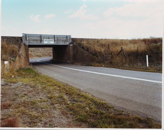
Simon Joannou, Goulbourn Rail, 2006. Photograph. Series of 3.
Courtesy Groundfloor Gallery.
Unusually for a commercial space Groundfloor Gallery has wall texts explaining what the artist was aiming for in each of their works, some biographical details and other relevant information. The texts are written in the first person or in a distant and authoritative third person. In some cases, this was very helpful, in others perhaps a little unfortunate. Patrick Donohoe, for example, writes about his older work as being “simplistic line drawings”. Simon Joannou, describing his photographs, explains they are called Unlikely Places Series because they are a series of unlikely yet interesting places. And indeed they are. Joannou’s images were by far the most compelling works in the show, displaying a sure and certain approach to composition as well as having a knack for framing a shot to evoke a blank narrative. The show’s other photographers Gareth Jolly and Barbara Doran work in familiar territory. Jolly’s reportage shots from South East Asia, Sydney and Cuba are admirable if workmanlike examples of photojournalism but it is Doran’s fantasy images that are the most confronting. Called the Vardy Doll Series, a generously proportioned woman is dressed in bustier, frock and other accoutrements made from cake icing. She seems to be having a whale of a time seen in the last frame eating her own clothing with a big grin on her face. It’s not an experience we’ve had ourselves but it looks like fun.

Pam Aitken, Texts for nothing 12, 2001.
Oil paint on flute board, 286×753 and 286x579cms.
Photo Pam Aitken.
If only for the sake of contrast, one could not pick a more different gallery from our first two than Sydney Non Objective in Marrickville. Known simply as SNO [and happily leaving itself open for all sorts of jokes – it’s sno-good, it’s snot open] it turns out that the relatively young gallery is a utopian experiment in radical minimalism. SNO is a home for artists who work in a tradition that began with Alexander Rodchenko. Billy Gurner, one of the gallery directors, talks in terms of “post-20th century abstraction” which in practice is a pared down, highly individualised art making, devoid of reference to anything other than its own terms of creation – an investigation of, for example, the formal qualities of colour, shape and repetition – and perhaps the history of such a practice. The easiest reference point in this kind of work is that of John Nixon. His series of non objective self portraits run now into thousands of individual pieces, which have appropriated Malevich’s cross, used a restricted colour range and spread out into the utilisation of similar forms – ceramics being a good example from Nixon’s work at the Adelaide Biennial. Non objective art is hermetic, a self contained practice that is both open and closed – open to history, yet closed to invasion by openly expressive elements. Ironically non objective art is also perhaps the most expressive non expressive art there is, a model of expressionistic impulses contained within incredibly tight formal parameters, yet evidence of obsessive physical repetition.
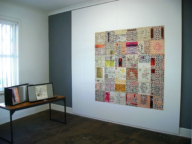
Daniel Argyle, World Records, 2005-6.
Mixed media, variable dimensions. Installation view.
Courtesy the artist.
SNO has four exhibition rooms in what was once an upstairs apartment above a shop at 175 Marrickville Road. Pam Aitken has two of the rooms in which she has mounted flute board [a kind of plastic panel] in two grids of 5x5x11 boards, the corner of the room intersecting the middle of the grid. The boards have been painted with oil paints in shades of blue green, most of them just a gestural wash, some with a few dribbles here and there. One room mirrors the other, a right hand corner in the left hand gallery, a left hand corner in the right hand gallery. If you stand in SNO’s adjoining corridor and look back at the two rooms, the two grids can appear as a cube. In the middle room, Marcus Bering has a series of drawings on paper mounted behind glass, a mounted circular object and a piece of steel with holes punched randomly in it stuck to the wall. The drawings continue the circular motif, some scribbles in orange, others filled in. As far as allowing an outside influence into the works, Aitken and Bering’s work are armour plated, free interpretation bouncing off their art like a tennis ball thrown at a tank.

Daniel Argyle, World Records, 2005-6. Mixed media, variable dimensions.
Courtesy the artist.
Daniel Argyle’s work is just as contained – indeed, it literally comes with a container – but its edges are more shaggy, allowing curiosity and interpretation to grab a hold. Argyle’s work, World Records 2005-2006 collects together record covers from the legendary World Record Club, a pioneering label from the mid-60s that was a kind of proto-world music label which released a wide range of material including exotic classics such as Dr. V. Balsara and His Singing Sitars [an Art Life office favourite] as well as classical works and disco hits. Argyle has taken the covers to Igor Stravinsky, Ron Goodwin and His Orchestra, Cleo Lane and other dance favourites, carefully cut the back covers off, sliced them into a pattern lifted from an Islamic ceramic design, then placed the back covers over the front covers. Arranged in a grid, the work is visually dazzling, continually pulling you into details before being throwing you back out again into the complete design. Argyle has also constructed a case for the work so it can be packed up and stored away. You get both a complete abstract design and an attractive storage solution – now that’s what we call modern art! Rodchenko said in rejecting pure art as a parasitical activity that “the art of the future will not be the cosy decoration of family homes”. Ironically that is exactly where non objective art can now happily live.
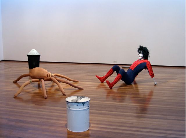
Stephen Birch, Accumulations/Accretions, 2006. Installation view.
Mixed media, variable dimensions. 9 parts. Courtesy Kaliman Gallery.
Hermeticity is not just a problem for interpreting abstract art. Using figures, recognisable objects or pop culture references is no guarantee of an explicit or obvious intention either. On our return to the apparent safe haven of lower Paddington and Kaliman Gallery we were confronted with Stephen Birch’s show Accumulations/Accretions which is as hermetic and inscrutable as the spots and circles, dribbles and dashes at SNO. In the installation which takes up the entire gallery space, Accumulations/Accretions features a figure in a Spiderman suit who is being menaced by a spider with a human face. The dude in the Spiderman suit is revealed to be none other than Peter Criss, the original drummer in pomp-rock legends Kiss, his secret crime fighting identity revealed by the unveiling of the mask to be another alternate [and equally fake] identity beneath. The spider meanwhile, recalling monsters from John Carpenter’s remake of The Thing, comes with a human face. Who is it? The beard of course suggests Osama Bin Laden, but we were also thinking of famed Russian dissident and author Alexander Solzhenitsyn. It might also be Syd Ball. A compare and contrast comes down on the side of Solzhenitsyn. The two figures – Spiderman/Cat/Peter Criss/Peter Parker and the Solzhenitsyn/Spider – are surrounded by various bits of sculptural detritus including two casts of plastic buckets – one with gravel – and amorphous forms that might be arms. Did we mention Peter Criss was missing an arm?
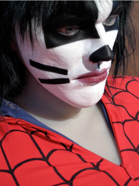
Stephen Birch, Accumulations/Accretions, 2006. [detail].
Mixed media, variable dimensions. 9 parts. Courtesy Kaliman Gallery.
The story of Peter Criss is rock tragedy at its most piquant. Starting out as a jazz drummer in the 60s, Criss met fellow band members Paul Stanley and Gene Simmons after placing an ad claiming that a hard rocking drummer wanted to meet similar – object; starting a band. Kiss was born. One might argue that Criss was as much Kiss as the other two but it was he who left in 1980 to start a solo career leaving the others to head off into panto history. Ill-fated from the start, his solo albums Out of Control (1980) and Let Me Rock You (1982) stiffed and not even a later collaboration with Simmons could muster anything like a hit. Rumours began to circulate that Criss was an alcoholic drug adict living on the streets. Celebrities Roseanne Barr and Tom Arnold came to his rescue but a homeless man found living under a bridge who claimed to be Criss turned out be a hoaxer. In a strange moment, the hoaxer Christopher Dickinson appeared with the real Criss on The Phil Donahue Show in 1991. Criss, meanwhile, was in and out of Kiss for reunion tours, sometimes playing sell out shows, other times ignominiously replaced by other fake “Cats” – Eric Carr and Eric Singer.

Stephen Birch, Accumulations/Accretions, 2006. [detail].
Mixed media, variable dimensions. 9 parts. Courtesy Kaliman Gallery.
Birch’s work toys with the vagaries of identity – Peter Criss being a vessel for the true revelation of the fiction of identity – but there is also a palpable sense of frustration here as well. Criss is menaced, or perhaps giving birth to, a principled monster of resistance, a Gulag hold out against the depersonalization of the Soviet state, nay, of all totalitarian systems. One may wish to be as famous as Criss, but rock fame will mess with your head – or you’ll lose an arm – or something something something…