Over the last few weeks the real has seemed incredibly real. More real than usual. Then slowly it slipped back towards the normal real, the day to day of our usual unreality, the microworld of contemporary art, busted up roads, colds and flus transmitted via those viral exchange nodes known euphemistically as “day care centres”. On AM radio – the measure of all reality – they’re either talking about how there isn’t enough rain, or, on another day, why there is too much. It feels like we have only two optional states, more of the same or more of something very similar.
This sense of recycling, things coming back to haunt us, is the basis of ReFrame at the Ivan Dougherty Gallery at the NSW College of Fine Arts. The exhibition showcases artists and designers who are making work that’s “an active response to current design practice and the culture of consumption” set in world that is “fast-paced, constantly changing, and rapidly dwindling in resources.” ReFrame tries to come to grips with various ideas about materiality – reuse, recycle, rebuild, reform. As Rod Bamford explains in an introduction in the exhibition catalogue:
“Materiality is the stuff of technology, and as such a foundation of sustainability. All things are material. Materials provide the basis for us to envision, communicate and realize ideas. The array of ‘new’ or ‘advanced materials’ provides an increasing range of new possibilities for application and broadens the scope of design.”
So what does this idea look like? Well, there’s an awfully large amount of material and accompanying text explaining the nuances of how each artist/designer/architect/craftsperson tackles this idea. Looking at a work by Kevin Finn called A Slight Difference, for example, it appears that a group of letter keys on a computer keyboard have been replaced by the cursive font keys from an old typewriter. This disjunction of materials sets up an expectation that by pressing these keys you’re going to get a different font on paper or screen. But computers don’t work that way, so in a sense the sculpture is a work about the redundancy of materials and the ideographic signaling of one state when the result will be something else. Instead of Bamford’s formulation of increasing possibilities, Finn’s work actually points in the opposite direction towards stasis. You might well have an expectation for an increased scope, but baby, we ain’t going nowhere.

Suzanne Boccalatte, Readymade Makereadies [detail], 2006.
Offset print onto make-readies (recycled paper), A2 paper.
Courtesy the artist and Ivan Dougherty Gallery
ReFrame makes a number of assumptions about its audience. With so many brightly coloured objects, wall texts, light sources, things to wear, things to sit on, the space of the gallery takes on the aura of a shop – which is fine since that is where we most consciously experience that ill-defined, all-encompassing conceptual zone called ‘design’. ReFrame assumes that its audience is ok with the packed space. For the most part we are ok with it, yet in the context of the art gallery space, the pieces that function best within curator Karina Clarke’s gambit are the ones that have an explicit reference to their own status as conceptual objects rather than those that flirt, like Finn’s, with faux-utility. Suzanne Boccalatte’s Readymade Makereadies is a pile of cardboard posters made from leftover print offcuts with the words Don’t You Know Who I Am? cut into them. Visitors to the gallery are invited to take one and do whatever you like with it – go around town stenciling the words onto surfaces or perhaps leave it in the back of your car until the heat makes the poster curl. Boccalatte says in her accompanying text that the work is a comedic commentary on the status of the superstar designer, but given the variability of the text’s potential contexts, the statement goes from one of egocentric demand to one of pitiable pleading. Don’t you know who I am? Pleeeassse!
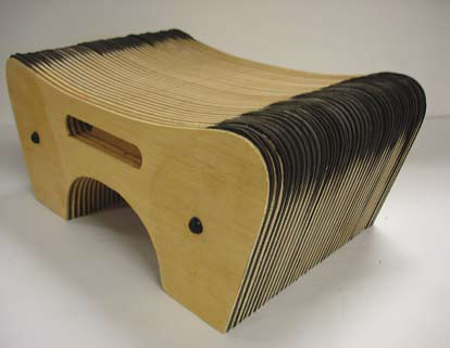
Szuszy Timar Armadillo, Sitting Object,2006.
Ply, MDF, Eva sheet, 46x45x22cm.
Courtesy Ivan Dougherty Gallery.
Like many designers with an itch, the ethos of ReFrame is that if a thing is good it has value and if it is bad – it’s wasteful, voraciously consuming of resources, needless, pointless and without an idea – it is bad. This is the other major assumption behind ReFrame and for the most part we agree with that broad and joyous decree. Putting it all together however is kinda hard. Financial pundits predict that the future of capitalism is about making less money out of more things, catering forever expanding niche tastes. Fordism is dead. Yet we can’t have a spectrum of wide consumption predicated on the idea of good values without mass production. How will humble artists and designers carry that notion into the wider world? That’s an open question but we know that as soon as a catalogue writer starts talking about Marxist notions of use, exchange and cultural value, the argument is as good as dead. Robyn Daw’s essay in the ReFrame catalogue makes promiscuous use of these terms, skating along on a deliriously positive note finding value in everything, but maybe that’s because she’s living in the year 21,000AD As the introductory sentence explains: “Design has a new, challenging role in the twenty-first millennium.” The world is so futuristic right now.
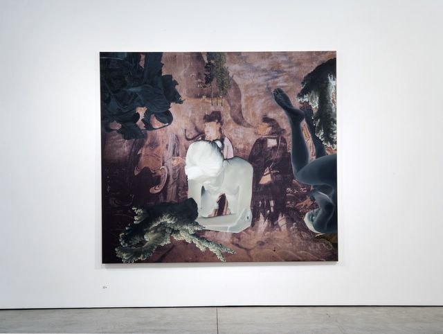
John Young, Painting for Spirits, 2006.
Digital print and oil on linen, 197 x 221 cm.
Courtesy the artist and Sherman Galleries.
John Young‘s latest show with Sherman Galleries is called Detours and Variations. His solo show in 2004 was an exasperating experience, the artist seemingly stuck in ever decreasing loops of minute stylistic variations with no real indication that he was going to do anything radically new any time soon. So here we are two years later and Young’s work has changed direction. He’s kept the much the same compositional approaches as his previous bodies of work, but where he was once content to use his array of effects, Detours and Variations seems to be the work of someone getting restless and ever so gently stepping into new ground. Young’s smooth and frictionless images have always had a tasteful skein of meaning draped over them, cultural collisions of imagery and derivations offered up for our contemplation, whose net effect was one of negation.. It wasn’t meant to be profound, it just was: naked girl in crouching position done in negative placed over a Chinese landscape, a flower top right, frames within frames, executed in a style-less style done by a crack team of art students working their way through VCA.
John Young, Roscoe, 2006.
Oil on linen, 125x100cms.
Courtesy the artist and Sherman Galleries.
Surprisingly, Detours and Variations is virtually the same kind of work but our sense of good will towards the artist and his new paintings was enormous because he appears to have surrendered to the immaterial. Half of the show is large canvases of familiar Young images – Macau features shot of an interior with a piece of coral painted over the top – Painting For Spirits is the most Young-esque – two naked girls tumbling in space, that bit of coral again and Chinese gent having a squint at left girl’s fanny. Meanwhile, on the other side of the room there’s a series of works in which the artists has painted [or instructed to be painted] a series of canvases that appear to be renderings of out of focus photographs. SKJOLDEN. SENTIMENTAL PAINTING. PILGRIM’s WAY. These new works are beckoning to the others – this way, come, we have nothing to lose but our solidity.

Lionel Bawden, The Inner World, 2006 [detail].
Mixed media, 204x82x3cm. Courtesy the artist and GrantPirrie.
Dark Matter is the title of Lionel Bawden at GrantPirrie and it’s a bobby dazzler. Bawden is an artist who had made a spectacularly popular body of work that pegged him as that guy who makes sculptures out of coloured pencils. Not only were those sculptures a curious point of difference to all the other artists of his generation, the work combined low tech and high tech into magical admixtures of the hand made and CGI. Sitting pretty on their polished acrylic surfaces they were the kind of sculptures you could have in your home, no worries. Bawden has now gone for the idea rather than the pay off, changing tack in his new show into a new body of sculptures which leave those wonderful old objects and heads off towards something far more challenging. Discovering that a domestic door has a honeycomb inner structure of cardboard cells, Bawden has taken a series of doors with one side removed and placed within them carefully selected pieces of beveled plastic. He has ordered them by size and colour, placed them inside the honeycomb and lent the doors against the gallery wall. On the opposite wall cardboard door structure pieces have been ripped out and stuck up.
The title Dark Matter is a reference to the theoretical cosmological material that can neither be seen nor directly measured, but whose existence has been deduced by the observation of the behaviour of distant objects. Although we don’t know if it really exists, dark matter is useful theory that explains why visible matter in the universe holds together. Bawden’s appropriation of this idea is elegant and simple and works as a brilliant analogy for the material play in his own work, from the big picture superstructure in the gallery to the minute reflections in the plastic edges.
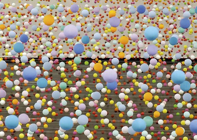
Nike Savvas, Atomic, full of love, full of wonder, 2005 [detail].
Polystyrene, nylon wire, paint, electric fans.
Courtesy Roslyn Oxley Gallery.
A similar kind of play with cosmological and subatomic structures is at the centre of Nike Savvas’s Atomic: full of love, full of wonder, a work included in the Art Gallery of NSW’s Adventures with Form in Space – The Fourth Balnaves Foundation Sculpture Project. Like Bawden and his dark matter, Savvas’s sculpture is more a loose reference point than a dramatic interpretation of scientific theory. The work is also fairly simple in the way it’s made. Polystyrene balls of various sizes and colours are strung up on wire in successive lines raked back to a distant wall. On one side of the room a bank of industrial sized fans come on in sequence. As the fans blow, the balls begin to jiggle up and down and soon, once all the fans are blowing, the entire room is a vibrating sea of colour. Savvas has ordered the colours to enhance the perspective and with just a little squint of the eyes you feel as if you are floating. For such a decidedly low tech installation [what, no DVD?!!] the effect is vast, cosmological, complex and spectacular.
Curated by Wayne Tunnicliffe, Adventures is probably one of the best AGNSW exhibitions of recent years. Its strength lays in its recognition that a simple idea can offer rich rewards. Shows such as UTS Gallery’s magnificent Art Movement: Explorations of Motion and Change earlier this year, and going back a bit further, Space Odysseys also at the AGNSW, were brilliant because the curatorial approach was to look at what artists are doing, recognizing a commonality within a particular form, and then bringing great examples of the practice together. The richness grows from the variety of conceptual and thematic interests the artists bring to it rather than trying to make everything conform to a single concept. Adventure is the latest example of this trend and we exclaim to the heavens, thank god!
Courtesy the artist and NeonParc, Melbourne.
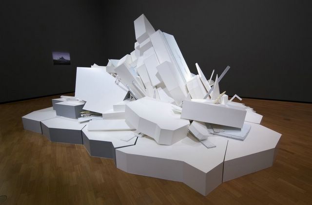
Tunnicliffe has selected a group of artists that represent a range of sculptural practice, each artist exploring the potentials of material through their work. Savvas’s piece – with its low tech, high effect impact – is a very clever choice for the exhibition’s main publicity image. It’s friendly, welcoming and has loads of visual impact. It also displays a very sophisticated understanding of how such unassuming objects can be put together to create something quite magical. Working in related way and not coincidentally installed in the next room, Damiano Bertoli’s Continuous Moment balances right on the border between abstraction and figuration. Based on a Caspar David Freidrich painting of an iceberg, Bertoli’s sculpture is an approximation of the iceberg’s shape created through a bunch of very ordinary objects – sheets of wood and plastic, fluro tubes, MDF and other found materials – painted white and piled up to match the contours of the ‘berg. Bertoli’s copy of the painting – again more schematic than descriptive of the ‘original’ image – drives home the point that the two works are approximations. In this instance, materials are both themselves and something else, it just depends on how you look at it – and how you light it.
Claire Healy and Sean Cordeiro sculpture is a link to what the catalogue calls ‘crypto realism’ – the use of objects to stand in only for themselves, albeit at the whim of the artist’s narrative. Healy and Cordeiro’s Self Storage is an example of their ongoing practice of taking objects and re-housing them in purpose built containers, rearranged into more compact spaces or simply bundled together. Self Storage is all the stuff left behind by the couple in Cordeiro’s parent’s garage when they went overseas to take up their Samstag scholarship. Inside a wooden house in miniature, there’s a sea of crap from old Sinatra records and Scrabble sets to bits of computer gear, an electric guitar, old artworks, a trumpet, a slab of beer. The challenge for the audience to is to connect to the artist’s narrative, appreciating the aesthetic way all this stuff has been arranged and making personal connections to the detritus. At one end of the installation is a relic of the 1970s – a very prominently displayed poster. It’s a hand drawn fantasy illustration of characters from Lord of The Rings done by Jimmy Cauty, once half of the Kopyright Liberation Front, also known as the KLF, furthermore known as the JAMMS. Do you suppose that’s an intended connection?

Jonathan Jones, White Lines, 2005.
Fluorescent tubes and fittings, 300x824cms.
Courtesy the artist and Gallery Barry Keldoulis. Photo: Scott Strothers.
We’ve discussed both Jonathan Jones and Hany Armanious’s work here recently and the two pieces in Adventures are fine examples of their art. Armanious’s series of pierces underscores the way he reuses similar motifs – cylindrical objects, repetitions, support structures, self contained systems and environments, reflexive elements. It reminds us of a game called Mouse Trap where you would take a whole lot of seemingly random elements that would eventually build you a baroque machine for catching mice. In Armanious’s case, the machine traps free associations. Jones, meanwhile, has a 26 meter long installation of his now trademark fluro tubes in a cross hatch pattern that runs down the long wall to the AGNSW coffee shop. In the catalogue Tunnicliffe observes that the most obvious connection to make with Jones’s work is to Dan Flavin. In this case we’d have to disagree – the most obvious connection is the work of Biennale artist Rafael Lozano-Hemmer, the artist whose work is installed in the foyer of the gallery, which is longer and motorized…
The only work we didn’t warm to in the show was John Meade’s mix of polished mannequins and a massive black, dildo-like object installed near the exit of the show. Meade’s work looks decidedly old fashioned, not in its materials or execution, but in the way the artist mixes pop culture quotes with what appears to be radically abstract forms. Although not alone in its deployment of hermetic reflexivity it offers little to the viewer. By contrast, Nick Mangan’s eye-watering forest of mutated wooden spoons, elk hair, axe and hammer handles offers no clues either but the sheer visual pleasures of the work bypasses any worries about obscurity. Perhaps Meade’s conceptual disco, with its references to Kylie seems old because the thing before last always seems really out of date. Mangan’s work, with its undeniable connections to Max Ernst already seems classic