…in which The Art Life returns to the Archibald Prize for Best portrait painting [preferentially of some man or woman distinguished in Art, Letters, Science or Politics], the Sulman Prize [for best subject painting, genre painting or mural project by an Australian artist], The Wynne Prize [for best landscape painting of Australian scenery, or figure sculpture] and the Photographic Portrait Prize [A Citibank Award] [for Best photographic portrait]…
Yes, it’s kind of late in the season to be getting on with the biggest beast of them all, but we decided to leave it awhile this year lest we were mistaken for bandwagon hoppers trying to get in on the whole Archi prize shindig. We had full intention of a doing a complete blow-by-blow of the entire line up of finalists but circumstances have conspired against us. The main problem with The Archibald for 2006 is that it’s a pretty poor field. As we’ve explained recently, that in itself shouldn’t be enough to stop us, but we just couldn’t rouse the enthusiasm to tackle it any further than we have already done.

Our next plan was to look at the competitions that actually offer some potential ontemporary art thrills– the Sulman and Wynne Prizes. They are ostensibly prizes for genre painting – one the very loose “subject” prize, the other for landscape painting or sculpture [presumably because a sculpture is in the landscape] – and since they are usually judged by just one person, an artist, they are idiosyncratic and sometimes a lot of fun. That’s not usually the case of course, with mainstream, middle of the road artists selecting mainstream, middle of the road finalists but at least the potential is there, and you’ve got to be hopeful. Unfortunately, the Art Gallery of NSW in its wisdom does not supply images of any Wynne or Sulman finalists except the winners of each category. This is a real shame because they could be turning what is usually just an Archibald Prize sideshow into competitions that could command their own audiences. C’est la vie.
The rather ponderous and obvious way the AGNSW has hung the Archibald finalists carries on into the Wynne, Sulman and Photographic Portrait Prize selections. Where in the Archibald, for example, all the impasto pictures are hung together so too in the Wynne you’ll find Paul Ryan’s Road To Coledale –a painting sagging under the weight of its paint – and Euan Macleod’s Smoke 06 – another massive impasto excursion into obviousness – either side of the faux texture of the winner, John Beard’s The Gap. In the Sulman, there’s a wall of paintings about kids – Mike Worrall’s Exit Deferred featuring some kids roller skating, Cash Brown’s self portrait aged 2 in Great Expectations and Marc Burstall’s Class Portrait [Berlin] which is self explanatory. There’s a “political” section to the Sulman as well – Monika Behren’s sledgehammer Sari Club seen in Primavera last year which features slabs of meat and coconut dolls, Joanna Braithwaite’s Diggers – a couple of symbolic dogs with limbs missing – and Adam Lee’s picture of Van Ngyuen and his brother called, perhaps predictably, Portrait of Van Ngyuen [The Prodigal Son]. Xu Wang’s Ian Howard and Michael Esson Were Rubbing the Tank in Beijing is hung nearby and might mean something if you knew that Howard and Esson are senior staff at the College of Fine Arts, or that Howard used to do pencil rubbings of military equipment, or that Esson looks vaguely like Napoleon, but we did know those things, but we still had no idea what the painting was supposed to mean. Xu Wang should be happy he made it into the show at all, as the large painting is actually on a wall outside the room where the rest of the show is, and is sort of hanging off the end. Better than poor old Evan Salmon whose painting Salamander is hung above the computers outside or Ildiko Kovacs, huge Ghost which is around the corner and next to the lift. Although you could probably look at the Kovacs from the coffee shop, it’s a bit of an insult to such a fine painter to hang her work in a separate part of the building.
The Photographic Portrait Prize [A Citigroup Award] has moved downstairs and perhaps its this swap that left the Sulman with an overflow situation, but whatever the reason, the crowds shuffling around the finalists when we visited last week leaves you with no doubt that after the Archibald itself, this is the most popular section of the prize line up. On a Thursday afternoon, the AGNSW offered lots of diversions for mums with kids – we unfortunately missed the Portrait themed puppet show in the foyer and would have loved to have seen the bit where Mr. Punch refuses to pay for his portrait and instead murders the artist and then buries him under the floor boards. Eastern Suburb types dressed in beige make up the rest of the crowd, sniffing at the photographs. A lady standing near us took a glance at William Yang’s Franko B, The Tattooed Man, a photo of a large naked fat man covered in tats and sniffed. “Disgusting,” she said quietly to her companion and they moved on…
As you probably know, photography is incredibly popular. The technology is cheap, you can outsource the difficult technical bits and these days you don’t even have to spend a lot to get large scale images. With such an egalitarian set up, you’d expect the PPA to be overflowing with interesting work that runs the gamut from utter shit to complete genius, but in fact the work represents some fairly predictable trends. There are the artists who are making work whose primary subject is their own subjectivity, either embarrassingly sincere or as slightly distanced role playing. There are professional photographers who work in the “industry”, that shadow world of people who make money by shooting images for ads and magazines and who have a portfolio of “personal work”, but don’t get much respect from the official art world. The third trend is the artists who are better known for something else – painting, or sculpture – having a go with a camera. The 2006 PPA has examples of all of these approaches.
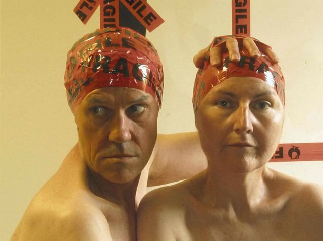
Rose Farrell & Goerge Parkin, Self Portrait. Digital colour print, 70x90cms.
Courtesy Art Gallery of NSW.
Let’s start with the artists making work about themselves. Rose Farrell and George Parkin, usually just known as Farrell & Parkin, have done a ‘funny’ depiction of their creativity, which is them naked with Fragile sticky strips plastered over their heads. It is an unlovely image that is completely obvious – their heads, you see, is where they get all their ideas from and apparently they are a fragile. It would seem that the very act of making this image is its own justification, assuming of course that you know or care anything about the people in the image, but not even a page of accompanying explanatory text makes it any better. The problem is that it is incredibly self aware, unfunny and really poorly done. In comparison to other works, however, it is a model of modest subtlety.
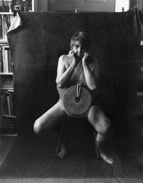
Lewis Morley, Mill Stone, Digital print, 62x48cms.
Courtesy Art Gallery of NSW.
In 1963 Lewis Morley did a shot of Christine Keeler, a woman who had got caught up in the Profumo Scandal. It’s ancient history now and the only reason the image has any currency at all is that the photographer hasn’t been shy about using it to promote the rest of his career. Over the last decade we have seen Morley’s Keeler portrait dozens of times and its most recent outing was in a group show at the Australian Photographers Gallery in Balmain about three months ago. You can’t really blame the artist for trying to squeeze whatever he can out of what is undoubtedly a famous image, but at the same time you have to wonder at his gumption at claiming that it’s his personal mill stone. In his self portrait hung in the PPA, Morley is sitting in he same pose, a mill stone hanging from his neck. Subtle? It’s as subtle as fuck.
Petrina Hicks, Aicha. Lambda digital print, 85x110cms.
Courtesy Art Gallery of NSW.
Petrina Hicks is a commercial photographer with a strong career doing fine art. Someone suggested to us that her work really wasn’t worth considering because, in the opinion of this person, it was rather too much like the work of a well known European photographer. We had to agree, there was a certain similarity in her work at her last show at Stills Gallery, but we didn’t really care, it looked good and we liked it, and that was enough. On seeing her image Aicha in the PPA, however, the similarity to Erwin Olaf is hard to deny. Not that that matters, it just is. But if Hicks’s work is like Olaf, then Olaf is a bit like David La Chapelle and La Chapelle is like… well, hundreds of photographers the world over. Who got there first? The look of this hyper glossy, slightly overexposed and immaculately composed image is just one of a number of current commercial styles. Hicks does it extremely well, but if like us you search for some personal idiosyncrasy that will set a work apart from all the others, Aicha isn’t where you’ll find it.

Marcus Enno, Nik Orr. Digital print, 158x127cms.
Courtesy Art Gallery of NSW.
Curiously one of the other major international photography ‘looks’ – the Nan Goldin school of seriously depleted aesthetics – is pretty much absent from this year’s PPA. What it is there, is the look and feel of a slightly up-market Wolfgang Tillmans, where artists take images that are slightly casual, slightly diaristic, but are beautifully framed and presented, you know, like art. One of the very best examples of this approach in the PPA is Marcus Enno’s portrait of his friend Nick Orr. Since artists started making work that is indistinguishable from mainstream commercial image making, it has become exceedingly hard to recognise what is art and what is an ad for jeans. The clue is in the way the image is framed. In Enno’s portrait Orr’s head is just above the centre of frame, with loads of vacant head space above. Most commercial photographers like to get in nice and close, with hardly any head room at all – in Hicks’s work, there’s very little. We know this approach is hopelessly fashionable, but we like it – it’s like saying you’ve got the space but you don’t care how you fill it up.
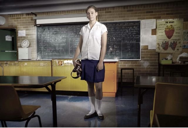
North Sullivan, Australia’s Youngest Karate Black Belt [December 05].
Ultrachrome, 84x119cms. Courtesy Art Gallery of NSW.
Another commercial photographer is North Sullivan whose work Australia’s Youngest Karate Black Belt 2005 is among our favourites in the competition. You’ll notice there is very little head room above the subject, but in relation to the room, the lighting and the stance of the girl, it’s like a work of pure classicism. The theatricality of the shot is mesmerizing without being demonstrative – the lighting effects and the way in which the foreground is darkened – and works brilliantly with the completely unaffected expression on the girl’s face. Somehow we like the image even more when we know that this really is a picture of the youngest karate black belt.

Jacqui Stockdale, The Nature Maker.
Courtesy Art Gallery of NSW.
Making an image of someone seems to work so much better if there is a relationship between the sitter and the artist – somehow the frisson of familiarity brings something out of the subject that even the hardiest of professionals can’t evoke from a studio session. Last year’s winner Cassandra Mathie’s Ali and Rahma was an image that had everything going for it but a real connection with the subjects. In this year’s finalists there were plenty of tricky images of well known people, gallerists, actors, musicians and self portraits, but few actually provided something beyond the obvious. One image that did go further was Jacqui Stockdale’s portrait of fellow artist Kate Rohde, the sculptor/installation artist who makes elaborate installations of faux fur animals in faux museum settings. There’s something unnerving about the way Stockdale captures Rohde, a playful innocent sort of gaze with the devilish creature she’s gently stroking in her hands. The tree fronds in the backgrounds are taken from an early European painting of the Australian landscape, a subtle and genuinely amusing reference to the fantasy element of Rohde’s own work and its links back to the earliest Colonial art.