As the flood waters begin to recede into memory, business resumes at Brisbane’s commercial galleries, writes Sharne Wolff…
It’s taken a while but the Brisbane art world is now almost back in full swing since the floods of early 2011 devastated large areas of the city, forcing the closure of the Queensland Art Gallery and nearby cultural centres for over a month. The Gallery of Modern Art has reopened with the popular 21st Century: The First Decade and two new shows at the QAG featuring Lloyd Rees and E. Phillips Fox & Ethel Carrick begin in March and April, signalling a definite ‘back to business’ attitude all round.

Krista Berger, My Warsaw Isn’t Your Warsaw.
Bronze, 45x20x32 cm
In the meantime, Jan Manton (whose gallery until recently was located right across the road from the QAG) must have been counting her lucky stars she made the decision to move at just the right time to escape being inundated by the rising river. Now on the city fringes at Spring Hill, Manton is another gallerist to move out of the ‘white box’ and into more relaxed premises. Amongst other advantages her new apartment-style space enables patrons to see how the art they are buying will look on the wall of their own home. Right now it seems like another new gallery model is tried every other week. It will be interesting to see what form survives best over the next decade.
The first show of the year at Jan Manton Art showcases three Queensland artists in an exhibition of works appropriately titled Drawn to Abstraction. Perhaps once a bastion of conservative art taste, Manton considers Brisbane art buyers now well sophisticated in their appetite for the contemporary. The artists in this show – Krista Berga, Daniel Mafe and Judith Wright – all have established practices and are some of the stable of artists championed by Manton in a gentle push to ensure the exposure of the new in Queensland.
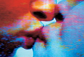
Krista Berga is a talented drawer – evident in this show via her small sculpture works and several oil paintings. Collectively the works are all very dark and almost gothic in appearance, and with one exception use the human figure as a subject. The small black sculptures in bronze are tactile and sensual –no attempt has been made to create a smooth finish with the metal and the working is quite apparent. Each sculpture comprises creatures morphing and contorting from human to human or from human to bird. Three other works entitled Let it Come Down I II and III are heavy with oil on canvas. No paint has been spared and the brushwork is evident. The black paint is shimmery in appearance and in each case lets through the eerie subject matter – a human face all but obscured except for a small part of the nose. The paintings are ambiguous – dark but not necessarily fearsome, and possibly even timid.
For My Other is an interesting installation work made in the shape of a cross with dark ink on paper. The work takes its title from the poem that emerges from the typography on the paper. Berga has experimented with this same technique in earlier works. By inking out reams of text and letting only selected words or phrases emerge, the artist allows the painting to have its own life, to select its own personality. Or does she? The paper is laden with ink. The phrases include lines such as, “I for an eye spoke my promise” or “I learned that the world turned”.

Daniel Mafe, Untitled # 1
Acrylic on canvas, 200x150cm.
Daniel Mafe has just completed a PhD at the Queensland University of Technology and has worked with abstract over many years showing with Manton since 2004. Each of the three works in this show, ‘Unititled’ I II and III, comprise a large canvas with an accompanying smaller canvas which Manton described as being akin to the ‘protector’ and the ‘protected’ – if not as parent and child. Mafe apparently spends time contemplating where best to place the smaller canvas in relation to the large to achieve the right balance for his compositions. The canvases usually take a long time to paint as Mafe constructs dense layers and shapes and continually reworks the surface. As pictorial displays they are compelling. Untitled #1 is the largest of the three and works well in this show – like a visual explosion of colour and mind.

Judith Wright, Desire # 2
Acrylic and wax on Japanese paper, 100x100cm.
As the third artist in an emotionally charged show, Judith Wright has used the medium of Japanese paper as a support for her acrylic painted works. Each is also covered in a thin layer of wax making the paper appear almost translucent and softening the lines of Wright’s solid abstract figures.
Using a palette of warm bright colours, Wright has intuitively applied paint to her indeterminate subjects that seem to float on the paper as if in a dream-like state. ‘Between’ speaks of the space between two existent states – life and death, or reality and dreams perhaps? The Desire sequence of four works sees the ambiguous figures move calmly past the viewers line of vision and considers the ideas of loss, emptiness and more space – like an underwater world, or possibly one without gravity. I particularly liked the idea of two or more of the Desire works being hung together as the colours and the aesthetic were so well balanced when seen this way.
Krista Berga, Daniel Mafe and Judith Wright
‘Drawn to Abstraction’
Jan Manton Art
Until 23 March 2011

Hi
I love reading Sharne’s gallery reviews – keeps me up to date on what’s happening.
Miranda