
It begins – as it always does – in darkness.

Production logos are the logos of film studios. The earliest examples date from around 1909. The roots of the production logo are found in the cards that were used in live theatre and vaudeville to announce the names of lead performers and the company footing the bill for the production. Film production logos began more or less with the birth of commercial cinema and usually featured the movie title and a copyright notice.

The best known of the logos is arguably that of 20th Century Fox. The 1934 merger of 20th Century Films and Fox Film Corporation created the classic and highly recognisable symbol of the joining of two corporate entities. Nearly all of the current major Hollywood studios have logos that date from the early 20th century. – MGM’s logo is the oldest still in use – although now mainly as a distribution logo – and dates from 1924. The second oldest is Paramount and was originally used in 1928
The logos of the major studios are among the most recognised trade marks in the Western world and could be considered the “blue chip” brands of entertainment, easily ranking in recognisability next to brands such as Kodak and Coca-Cola. These production logos include classic and highly recognisable elements; Fox’s searchlights, Universal’s globe, Paramount’s distant mountain, Warner’s shield and iconic “W”, MGM’s lion, Columbia’s torch bearer, Disney’s castle, Tristar’s pegasus, United Artist’s stylish initials, Orion’s outer space.
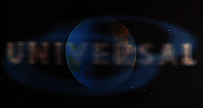
The highly compressed narrative of the production logo is the revelation of the production company name accompanied by some form of symbolic rendering of that name. Universal’s world logo [seen here in its mid-1970s version] is a slow reveal of the Earth in space with the company name slowly appearing on top. The more recent logo is a high tech version of the same narrative. Nearly all of the classic production logos offer some alternative version of this idea and with only the exception of Paramount, are accompanied by a fanfare.

“The Greek logos has a wide range of meanings, and designates both a rational or intelligible principle and a structure or order that provides phenomena with an origin, or that explains their nature…
“…In Christian theology, the logos becomes the Word that was with God and that was made flesh when it was incarnated in Christ. The opening verse of the fourth Gospel provides the most sublime example of logocentrism: ‘In the beginning was the Word, and the Word was with God, and the Word was God’. The critique of logocentrism is a central feature of Derrida’s Deconstruction. According to Derrida Western philosophy from Plato onwards has always been logocentric in that it makes speech, or the logos, the origin and site of truth, which privileges the phonic aspect of language at the expense of the graphic aspect of writing.” David Macey, The Dictionary of Critical Theory, Penguin Reference, 2000,
“When we look at the world around us, we do not, as a rule, see changes in light flux over time. We see solid objects moving and standing still in a well-defined three-dimensional space (at least, that is see in the most focused, central area of our vision). Nothing would be visible, however, were it not for the “light flux” entering our eyes through the pupil and flowing over the photosensitive cells lining the back of our eyeballs. Experiments have shown that when the retinal cells receive a steady, unchanging fit, when the stimulus is absolutely fixed and unvarying, the cells quickly “tire.” They stop sending the information our brain needs to construct the visual world we see lying in front of our eyes. Thus there -as to be a “flux,” a movement of light over the retinal cells, otherwise we see nothing at all […] “All eyes are primarily detectors of motion,” R. L. Gregory points out, and the motion they detect is of light moving on the retina. Only by these changing patterns of illumination can the world outside our eyes communicate with the visual processes of the brain. From that communication emerges our visual world.”
The Camera-Eye, Dialectics of a Metaphor, William C. Wees, in The Cinematic Imaginary after Film, ZKM Center for Art and Media, 2003.
“In 3D computer graphics, 3D modeling is the process of developing a mathematical, wireframe representation of any three-dimensional object (either inanimate or living) via specialized software. The product is called a 3D model. It can be displayed as a two-dimensional image through a process called 3D rendering or used in a computer simulation of physical phenomena. The modeling process of preparing geometric data for 3D computer graphics is similar to plastic arts such as sculpting.” – Wikipedia.

The classic Fox logo dates from the 1950s when a static version was replaced by an animated and widescreen version suitable for use with Cinemascope presentations. The current computer animated version dates from 1994. Logos are a kind of brand archeology, not just displaying the various stakeholders in the company of the day, but also the types of technology available to render the logo.
“Brands that influence culture sell more; culture is the new catalyst for growth.” – Simon Williams, The 10 New Rules of Branding.
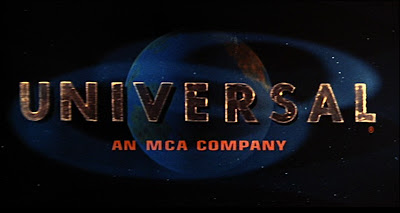
In his book Life Style, US designer Bruce Mau recounts his company’s unsuccessful bid to redesign the Universal logo. After a careful analysis of the logo – substituting other round objects for the Earth [a ball, a berry, a pollen spore] and varying the font – Mau concluded that the logo had only two components; a circle dissected by a line. The one element that was unique to the Universal logo was the camera movement over the Earth, the creation of a illusionistic three-dimensional space eerily reminiscent of the physical space between the viewer and the screen, or to step back further, to the title cards used for theatre productions.
For films released in Australian cinemas in 2006, productions by US studios accounted for 85.9 percent of the market share worth $774.1 million. Films from the UK accounted for 5.3 percent of the market [worth $45.8 million], while Australian films accounted for just 4.6 percent of the market [worth $40 million]. The “rest of the world” [Europe, India, New Zealand, ‘other’] accounted for the remainder of the market worth a combined total of $866.6 million. [Figures – 2006 Box Office Backgrounder, Australian Film Commission, January 2007.]
“Architectural design conceived as part of an overall brand strategy can effectively demonstrate the promise behind a brand. An architect with Seattle’s NBBJ remarks “Branding is the chemical reaction in the back of your head that happens when you are exposed to a brand. For instance, when I’m exposed to Volvo, I think of safety. Physical space in a building speaks to you the way branding does. Architecture is a form of branding; it is more than making a place functional. It can affect emotions and decisions, just like great marketing does.'” – Emotional Branding – Whisperbrand.com

“In 1967 Jack Warner sold the studio to Seven Arts, Inc. The new company’s logo was a simple animated “W7” inside a shield accompanying the credit “Warner Bros.-Seven Arts Presents” over the opening shot or credit sequence background and was first used on Reflections In A Golden Eye. When Kinney Services bought the company and changed its corporate name to Warner Communications, they first chose a stylized shield as a new logo, used initially on Dirty Harry (1971); then, beginning in 1973, a stylized oval with a “W” in it.” – Everything You Wanted To Know About American Film Company Logos But Were Afraid To Ask by Rick Mitchell, Hollywood Lost & Found.
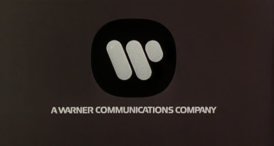
Classic film production logos have cultural cache and serve as temporal markers for when the film was made as well as its social context. There are many examples of contemporary films using period production logos to help set the tone for the following story – two notable recent examples are David Fincher’s Zodiac, which used a late 1960s version of the Warner Bros. logo, while Steven Soderbergh’s The Good German used a late ’40s version.
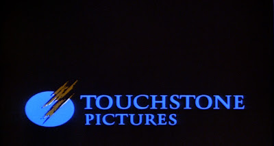
Although brand marketing states that a target audience aways appreciates a sense of gratitude, branding can also work against the content of a film. Touchstone Pictures are seen as specialists in 1980s camp classics with such titles as Ruthless People [1986], Outrageous Fortune [1987] Turner & Hooch [1989] cementing its reputation. Although the company has also produced many ‘quality’ movies [The Royal Tenenbaums, O’ Brother Where Art Thou] Touchstone Pictures will forever be associated with Earnest Goes To Camp.
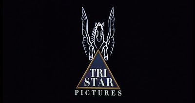
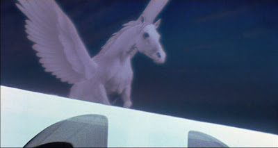
“Pegasus was the winged horse best known for his association with the Greek hero Bellerophon. The manner of the horse’s birth was unusual, to say the least. Its mother was Medusa, the Gorgon, who in her youth was famed for her beauty, particularly her flowing hair. Many suitors approached her, but the one who took her virginity was Poseidon, who is both god of the sea and god of horses. Unfortunately, the seduction happened in the temple of Athene. Outraged by having her temple defiled, the goddess Athene changed Medusa into a snake-haired monster whose gaze could turn men to stone. When Perseus decapitated Medusa, Pegasus and the warrior Chrysaor sprang from her body.”
– Ian Ridpath’s Star Tales.
“News Corporation revenue for the year ended June 30, 2005 was US$23.859 billion” – Wikipedia.
“Style is merely the outside of content, and content the inside of style.” – Jean-Luc Godard.
Presented as part of Pecha Kucha, July 27.
