Nick Terrell casts a critical eye over the pop cultural amnesia of Anthony Lister, Ben Frost and Franck Gohier…
Ladies and gentlemen, Anthony Lister: “Mankind is a product of its own reflection being fed to the masses through television. All of my life I have been educated by Americans on television in Australia. The cinema has replaced the church as a common ground where we can gather as humans and listen to stories and compare our simple lives and beliefs with those that are more worthy of fame than ourselves.”
Is Lister thinking of stories like X-Men and The Dark Knight? Maybe Gladiator or Troy? Or is he thinking of Great Man biopics like Ghandi? Perhaps it doesn’t matter – whatever it is he’s thinking of, that little phrase ‘more worthy of fame’ is troubling. It smacks of a conservative, hierarchical approach to ‘worth’ which sees fame as something earned (and therefore deserved) and which places the famous on a higher plane than the schmucks who look up to them. This is a failure of vision, and it’s one that tells in Lister’s work – it fails to take into account the socially constructed and artificial dimensions of fame and adulation.
You’d have to presume Lister loves the television shows that raised him (his cheerful artworks are full of them) and yet he seems somewhat anxious about the same thing being fed to ‘the masses.’ It’s the attitude of a cultural commissar, or a born censor at the very least – the masses must be protected from getting what they want. But you have to wonder, was televisual pap ‘fed’ to young Lister, or did he devour it avidly? Has it reduced him to a consumerist zombie, or did he manage to see through the gaudy appeals without losing his eye for their many charms?
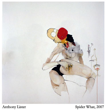
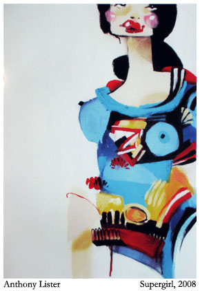
Lister’s work contains the effluvia of the digital media age which, it would seem, is a stylised reiteration of the effluvia of every other era within the ongoing epoch of Capitalism. Here are mutations of Captain America, Wonder Woman, Superman, Batman, Wolverine and The Hulk. An eleven year-old from 1965 could be expected to recognise most of the figures in Lister’s work. The child might be a little disoriented, though, by the emphatically over-inflated torsos and by the loose lines and intensified colours of Lister’s superfolk.
So times have changed a little. Black outlines over three-colour halftone separations were machine language – restrictive. Comic art needed more energy, more edge. Higher quality paper and a market that could support the cost of better quality printing opened avenues for more exacting artists to further cultivate a more engaged audience. This was an audience that could appreciate and sustain the idiosyncratic and expressive brushwork and inking of signature artistes. Lister’s touched up icons are the ancestors of that shift, they go back to Frank Miller (Ronin, Daredevil, Sin City), to Bernard Krigstein, to Paul Pope. Lister’s aesthetic is the result of all manner of gradual shifts away from the basic origins of consumer print media – and sadly those origins are all but effaced in his work.
For an artist who has had his own billboard to work on, Lister seems to barely engage with the visual conventions of printed mass communications. Sure, he’s a child of the digital age, but there’s no trace of the pixel either. OK, so there’s no romance with seminal print techniques – so be it. You get the sense though that Lister has turned his back on traditions and constraints that would galvanise his work. The images are overblown where they might have been pared back and elaborate where reticence might have yielded better results. Lister’s own claim to merely reflect the media, the age, is disingenuous, his works are a synthesis, a palatable pastiche – Lister talks of holding a mirror to society but the ‘reflections’ in his work are thoroughly designed. Lister’s composite figures distill multiple symbols and signs into one coherent, palatable whole. They offer easily digested, decorative realism.
Through his superhero figures, Lister is exploring the role of the virtual avatar and engaging with the symbolic function of mythic saviours. Virtual reality platforms like Second Life allow users to construct an ideal self-image, and more often than not, in bodily dimensions and costume, they resemble Lister’s biologically superlative grotesques. If you believe the advocates, Lister’s work asks how this aspirational visual symbolism will effect self-esteem, self-image, collective values and goals in the future. Christ was an avatar. Batman and Superman – more avatars. Is Lister’s chained up Batman (equal parts portentous pessimism and whimsy) another kind of crucifixion? Has the sacrifice been chosen? Batman, Superman, Spiderman – personal lives martyred to the higher good, they die for our sins every time they don the spandex, the cape, the cowl. And to eliminate any confusion on the matter (ambiguity is so inert) one of Lister’s characteristic diptychs sees Captain America hoisted onto a solid looking crucifix.
‘I’m not trying to change the world’ says Lister, ‘I’m just reacting to the world that’s trying to change me.’ Lister does change the world though, because his reaction is to refine and synthesise chaotic appeals into a coherent, composed whole. Place Lister’s work alongside Ben Frost’s Lost in the Supermarket canvasses and you see how mannered and conservative his reaction to the realities of US-dominated, digital mass-communication really is. Lister is a stylist not a realist. The same goes for Frost, but Frost’s work gives a greater sense of what it’s like to be in the belly of this whale we’ve all been swallowed by. In Frost’s paintings all the signs and appeals are there, superimposed, juxtaposed and ever-more cluttered. Lister’s work typically represents these same massed forces in a single, hybrid figure standing out vividly against an all but empty canvas. Frost presents a visual static that’s both diffuse and pervasive; Lister celebrates and amplifies the candy colour hooks and the T&A glamour with which the digital mass media screams ‘Buy!’ Frost, like Lister, is a former street artist making increasingly profitable inroads into the gallery marketplace. Frost was self-conscious about moving onto canvas and into the gallery, and no doubt Lister had his moments of doubt too. Can street cred survive in the gallery? Culture jamming mash-ups with street cred can attract a hefty price, but can street cred survive the translation to studio practice and the gallery wall?
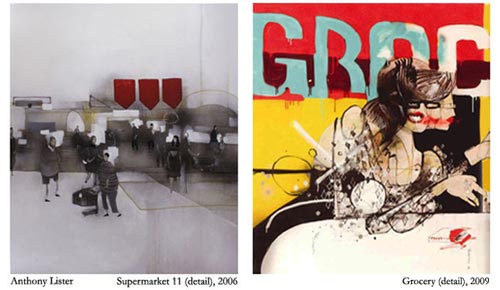
Lister’s precursors – Elizabeth Peynton, Jamie Hewlett, a touch of Schiele, a touch of Whiteley – all share his commitment to the real (at street-level) and to the direct appeal of mass aesthetics (Schiele sits apart from the lavishly decorative Klimt on the basis of subject matter – death, prostitutes, ‘real life’ – rather than style). And like his precursors, Lister’s reality is fashion conscious, stylish and selective. Compare the ‘Grocery’ of 2009 to the supermarket series of 2006 and you get the sense that Lister has begun to paint for an audience with a very sweet tooth. You get that sense even more so after a quick glance through the catalogue of Lister’s current 2010 show – the candy coloured avatars heroes, ripped and racked, are still in ascendance. Market forces say no more dozy grayscapes. Lurid pop-inflected grocery stores, yes (at a pinch), but serene, whimsical monochrome must go. It’s a shame. Lister’s misty interiors are more subtle and more satisfying than his figures, and they also acknowledge the social dimension that persists in these temples of consumption. Lister’s supermarkets are also a highly romanticised location. While the dominant grey, the low contrast and the absence of colour insist that this is a generic and lifeless environment, they also generate a kind of twilight mystery. This may be a site of coercion and control, but the reliability, the familiarity and the promise of this modern market place generate a kind of narcotic calm. Perhaps this is a smothered, underwater calm, but it is calm nevertheless. Maybe that calm is the sleep of reason, and maybe it comes at the cost of real choice, but aren’t there also traces here of an Arcadian peace?
Maybe not. Lister makes sure we don’t forget this peaceful vision is a tool of commerce – the one splash of colour, the beauty spot, is reserved for the ‘Sale’ flags. But for all Lister’s connection to the now, this version of selling is a quasi-mystical abstraction.
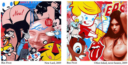
So unless you believe the supermarket is a temple, this version of selling is a lie. For Ben Frost, the supermarket is life now, and life now looks like this:
This is not a temple – there are icons aplenty but their potency is dissipated by accumulation and conceptual discord. Frost’s true vision is as subjective as Lister’s, but his quotations from sign writing, advertising, branding, commercial print design, graphic art, cartoons and pulp media are exact. Frost’s appropriation of the real thing along with the resonance he generates between so many mutually confounding and contradicting signs, give his works an aura (deceiving perhaps) of subversion and protest.
For Frost the supermarket is a trap – it is an environment in which coercive marketing strategies mimic entertainment and information, transforming individuals into components participating in a collective enterprise of consumption. It’s a bit much – there’s plenty of humour in Frost’s visual associations but not much in his sense for the power that these signs really hold. If we can laugh at their clumsy insistence, if we can see the common language shared by the soft-serve ice-cream boy and the page three girl, then can’t we also say ‘yes’ or ‘no’ to their appeal under our own volition? Frost relishes the vernacular but there’s an anxiety that runs through his accumulations: What if we can’t differentiate, turn off, cut through? What if even the strategies of ironic homage, knowing appropriation and low-brow sanctification can’t nullify the brand power stored up in the visual idiom of our commodified existence?
So the hard sell is ubiquitous to modern visual communication, and along with craven manipulations and lowest-common-denominator production values, it also generates energy and vitality, glorious absurdity, crude efficiencies and primitive appeals. Packaging and advertising are transmitting coded messages to the tribal mind. That, at very least, was the objective of the designers. Supermarket shelves are a rich and strange world, as much for the ill-conceived and the outmoded as for the representative and the telling.
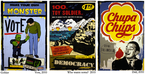
Franck Gohier’s most recent exhibition was branded ‘Produkt’ – the title is Soviet retro, but Gohier’s work draws on the whole-page ads that were liberally shuffled into colour comic books to further disseminate the capitalist ideals through the cultural colonies of the USA in the sixties, seventies and early eighties. Gohier is faithful to the look, the clumsy appeals and the cheerful stereotyping of these unforgettable campaigns. Gohier is playing pranks – ramping up latent sexism, racism, exploitation and moral hypocrisy – but there is a potent romance taking place between the artist and the basic language of four-colour halftone print design. And there’s another romance too, a nostalgia for the innocent, malleable child’s eye, imprinted with these crudely vivid appeals. Produkt seems to revisit the inception of an appetite for the image, while also seeing through the images with the eyes of experience.
Gohier’s work is steeped in print culture. Before he made paintings he made prints – he is a practitioner of the line and fill and a devotee of blunt and efficient visual appeals. At first glance, Gohier is pure pop, but an editorial or polemical dimension has been overlaid – where pop was cool, aloof, Gohier is hot, human and involved. Gohier’s satirical familiarity with the pop style suggests he is on more easy terms with this language than many of the iconic pop masters. Gohier’s images are free of false poignancy, mystery or sanctification.
Gohier’s satire is overt, and so is his enthusiasm for the absurdity and energy of the language he has co-opted. There’s Dali with the Chupa Chup logo he designed. Art for selling, artist for sale – but Gohier is sardonic about populist engagement and about the subservience of image making to commodity culture.
Frost and Lister seem paranoid about life in the supermarket, but in their work this paranoia only plays out as another dimension of product, while as an attitude or ideology it has reached a dead end. There’s something premature about Lister and Frost, as if they’re not quite sure they really hate the forces they demonise. Lister claims to be parroting the American media images he was drip fed through childhood by Australian commercial TV and consumer culture. He also hopes, you feel, that his avatar images will convey a rhetorical question to the viewer – Where are we headed? Are these really worthy ideals? Is this a healthy way to understand good and evil? But this rhetoric feels like an afterthought. The real pay off in Lister’s work, and the reason for his increasing popularity, is his anabolic inflation of familiar symbols. If Lister is trying to present these representative avatar figures as essentially problematic, he is failing. From the straightforward expansion of scale, through to the subtler messages conveyed in medium and technique, Lister’s treatment of these subjects validates them as a vivid, vibrant and legitimate force.
Anthony Lister – Macmillan Mini-Art Series No. 13
Ken McGregor and Jenny Zimmer
Macmillan.
Ben Frost – Lost in the Supermarket
Boutwell Draper Gallery
Franck Gohier – Produkt
Ray Hughes Gallery
This post was originally published on The Ember. Reproduced with the kind permission of the author.



You can throw that waste of paint Denis Ropar in the mixer with the rest of these commercial sellouts. These guys have memorised the recipe for the biggest fluffiest bogan wedding cake – you know the one that is 5 tiers high, decorations all over, gold and silver, little bit of this, little bit of that, statue of themselves as gods on the top! – but when you taste it, it’s just yesterdays dry old fruit cake in the middle of some sugar coated render. You could have written the same critique about these guys 10 years ago!
Hi Blah !
Intersting that you should lump all three of these completely different Artists in one pigeon hole ( and throw Denis Ropar in the mix too !?).
Did you actually read the article ? Take for instance Franck Gohier. Have ever seen any of his work before or are you aware of his political convictions before labeling him a “commercial sellout” ? Here is a link to an article by Roger Butler of the NGA if you are interested
http://www.printsandprintmaking.gov.au/catalogues/bibliography/626408/butler-roger-red-hand-prints.aspx
The fact that that these three Artist show in a commercial context and that they are all commercially succesful does not make them “sell outs”.
Lighten up Blah.Your comments sound like those of a frustrated Artists that can’t get a gig !
An Artist who doesn’t get invited to Bogan weddings.
robert hughes was right all along
POP CULCHUR B4 IT POPS U!
Cool!
I have indeed seen all their work before…
but who said anything about commercial success?
Good for you Japanic – all the more cake for you!
yes, if you really loathe something, best to just ignore it and save the energy