Marcus Trimble , one of the four principles behind Sydney architecture firm Super Colossal is also a talented and committed writer who blogs on architecture, design, film and art. Here he shares his thoughts on the representation of architecture in Christopher Nolan’s films from the Dark Knight and Inception… [If you still haven’t seen Inception, there be spoilers below]
Inception has been receiving its deserved attention. Primarily because it is a very good, smart action movie, but also, at least in this neck of the woods, because it is about urbanism, game design, and has characters described as architects.
Of particular interest to me though is the portrayal of the generic downtown in Christopher Nolan’s last three films; Batman Begins, The Dark Knight and now, Inception. These are films that are fantastic in the extreme; orphaned Billionaires trained by immortal super terrorists to fight crime, an enigmatic embodiment of chaos, dreamscape heists and so on. Yet amid this fantasy, the backdrop is consistently the generic, ordinary city. Like fellow film maker Michael Mann, Nolan is exploring the contemporary generic downtown as the site of intense conflict. But whereas for Mann—in films like Heat, The Insider and Collateral—downtown is the backdrop to testosterone injected real world clashes in masculinity, for Nolan this site of steel and glass curtain walling it is the site of the fantastic.
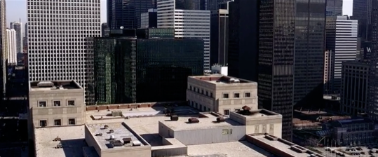
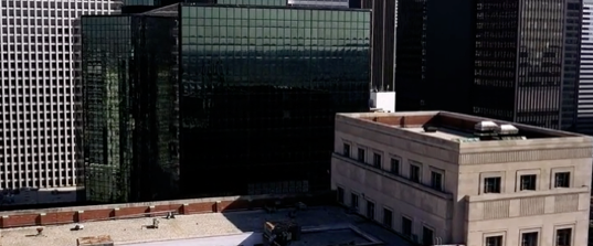
Nolan’s Gotham city could not be further from the way that it has been typically depicted in the comics or the previous films released in the late 80‘s and 90’s. Tim Burton and Joel Schumacher’s Gotham cities were overwrought gothic candyland, and pure candyland respectively. Nolan’s Gotham, however, is a sunlit, steel and glass financial district, the kind of place that exists in most western cities. A capitalist anywhere.
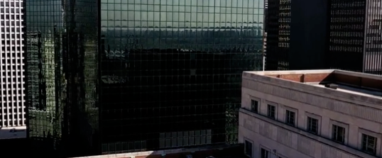
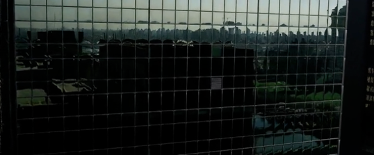
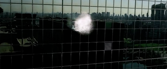
The opening of The Dark Knight, maybe my favourite opening sequence of any film, is emblematic of this. We slowly track over rooftops towards the face of a curtain wall, to a thunderous, rhythmic, soundtrack, the picture – impossibly crisp imax. The wall approaches slowly, all dark mirror glass and black mullions. One of the panels explodes, revealing within clown masked goons with grappling guns; something is rotten in the interior of this city. Cut to street level and we are behind a figure, standing on a busy intersection, mask in hand ready to unravel the social order of the city over the next 120 minutes.
So too, Inception presents the city as every city. Part of the genius of the film is that it presents the dream worlds as strikingly normal. There may be the occasional cliffside city crumbling into an ocean, but generally the action taking place in the dream is the non-space of the everyday; hotel corridors, apartments, elevators, city streets and so on. This makes sense as as Cobb (di Caprio) tells us early on, “dreams feel real when we are in them. It is only when you wake up that we realise that something was actually strange”.
It is why in an early scene of the film in a street in Paris, where the rules of Inception’s world are explained to Ariadne (geddit?) when the street explodes sony-bravia style around our protagonists before the city folds up over itself, that the film falters. Here, the desire to create a Matrix Bullet Time Paradigm Busting Moment takes over from the film’s own logic. The impossible is drawn too clearly and we are pulled from the normality of dreaming and into a technology demo. It is the only moment of the film where I felt drawn from the narrative and luckily, the film soon forgets about these tricks and moves on to the heist.
Given this, I find it curious that several critics have been disappointed that the film did not represent dreams in an outlandish enough way, as though, ‘because you can’ is reason enough to go crazy with the dreamscape. Burt Reynolds declares his wish to kayak down the river at the start of Deliverance “because its there”, and look where that gets him.
Aaron Betsky, lambasts the film for its ‘banal’ architecture, as though architecture is entitled to be represented as progressive whenever a film talks about architecture and in particular when the constraints of the waking world are lifted. A film, of course, does not owe ‘Architecture’ anything; rather it owes a service to its own internal logic. There may be a number of holes in the film’s logic, but its approach to the landscape of dreams is not one of them. It explicitly states that the role of the architect (read level designer) is to create a place in which the dreamer is comfortable, so that they do not realise they are dreaming, enabling the team to steal (or insert) whatever secret they are after. Hence, the generic downtown anyplaces we are shown. Betsky wonders “what would have happened if they had hired FAT Architects, MVRDV, or David Rockwell to design these sets”. Well, a cityscape designed by FAT or MVRDV—very good architects that they are—inserted into this narrative would be the equivalent of the unicorn riding a monocycle smoking a pipe; that is, a needless distraction and the tired cliche, that In Your Dreams Anything is Possible!
Remember, there is nothing more boring than other people’s dreams, and “Tim Burton’s Inception” is not a film that needs to be made.
Nolan’s cities are iconless places. The Hong Kong sequence in The Dark Knight omits the harbour, the HSBC and Bank of China buildings, and that city’s famous apartment buildings, instead focussing on vertiginous aerial view of the masses of anonymous buildings in Central. Cobb and Mal’s ideal city four dreams deep in Inception is an infinity of curtain walled downtown, ordinary in the extreme and all the more unsettling because of it. In any case it will be interesting to see where Nolan takes Gotham city in its third outing, likely deeper into the fantastic generic.
This post originally appeared at Super Colossal. Many thanks to Mr. Trimble for permission to repost here.
