Nothing beats quality. You can feel it when you walk into a shop that sells expensive items, arranged just so, under special lights, perhaps with music playing somewhere in the background and [this being the future] the rich scent of just-made coffee in the air. It’s no use resisting the allure of the majestic shopping experience because the entire environment has been designed to capture your senses and lure you into an extended, sleepy reverie, a narcosis akin to lying under a warm blanket as you wait to be wheeled into surgery. Thoughts like these entered our heads as we encountered the beauty of the new Kaliman Gallery.
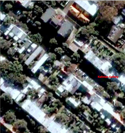
Kaliman Gallery as seen from space…
Our knowledge of the new Kaliman premises stretches back the final few years of Coventry Gallery when the entire place was as still and as quiet as the grave, an eerie isolation perfectly captured in Nigel Thompson’s portrait of the late Chandler Coventry. In the picture, the wheelchair bound gallery owner is marooned in vast polished wooden floor, the dull light of the outside world beckoning like a portal to the next life. Downstairs, the old second smaller gallery was a completely different experience as the entire room seemed to be carpeted with sea grass matting. For those of you who have never experienced sea grass matting, you are very lucky, as the smell is what you’d call ‘funky’ – bong water mixed with sweat and joss sticks. Fast forward into the 1980s and the highly polished sheen of Coventry gave way to the dull grey era of Gitte Weise Gallery. Nothing kills a work of art like florescent tube lighting, rendering everything pallid and spectral. Shoving a bunch of really unremarkable art into the gallery does nothing for the experience either.
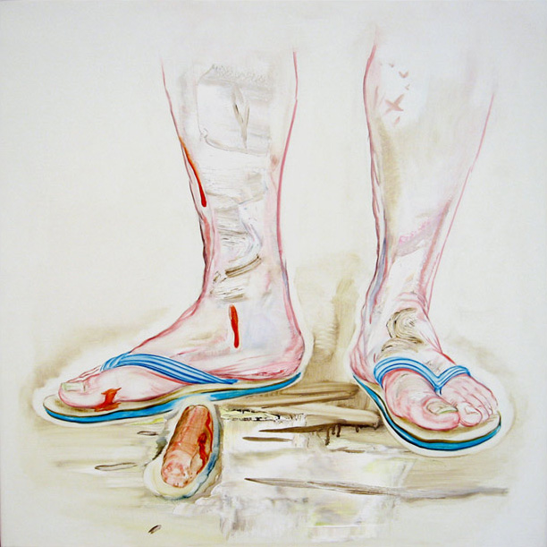
Tim Mcmonagle, When good times turn sour #2, 2006.
Oil on linen, 77x77cms.
Courtesy of Kaliman Gallery.
[click on image to enlarge]
Now, some millions of dollars later, Kaliman Gallery emerges. The outside is painted black with the words “Kaliman Gallery” rendered 3D with the same font as the one on the home page of the gallery’s web site, making it feel like the Gem Saloon of the Paddington art belt. But instead of whores, drunks and a proprietor who could swear the hind leg off Jesus H Christ himself, the interior is a designer drug for the senses – naked wood, freshly painted walls, museum grade lighting, a low ceiling and a gleaming chromium coffee machine.

Tim Mcmonagle, Yuho, 2006.
Oil on linen, 122x122cms.
Courtesy of Kaliman Gallery.
[click on image to enlarge]
The challenge for any artist in this new space is to look good, and the paintings by Tim Mcmonagle certainly look good. Big, sketchy pictures done over creamy backgrounds, the paintings are narratives of sublimated sex. With rather odd echoes of the 1980s work of American figurative painters like Eric Fischl and Alex Katz or perhaps a more sober Stewart McFarlane, Mcmonagle’s pictures attempt to present one story while really being about another. It’s a world of bourgeois luxury, decadence, grey hounds and back yard bbqs. As The Esteemed Critic noted in his grudging review in the Sydney Morning Herald, the artist’s double play is most evident in a pair of paintings called When Good Times Turn Sour #1 and #2 in which a tomato sauce splattered sausage lays bereft next to a man’s bethonged feet. Ok, yeah, castration – but a sausage on the ground is just as tragic and so long as you declare the 5 second rule, you’d could probably stick it back on and no worries. Elsewhere there are a couple of paintings of people reclining in hammocks covered in goo [maybe spaghetti, but maybe something else] but the pick of the bunch, and by far the most obviously perverse picture, is the mammoth Yuho [122x122cms] a painting of a naked Japanese woman in a bath wearing rubber gloves. Do we have to draw you a picture? Actually we do…

Syd Ball, Saxon Conquest, 1974.
Acrylic and enamel on cotton duck, 181x241cms.
Courtesy Sullivan & Strumpf Fine Art.
[click on image to enlarge]
Another gallery with sumptuous spaces – albeit on a smaller scale to Kaliman – is Sullivan & Strumpf. Their big draw card at the moment is a series of paintings by Syd Ball from the 1970s. Just as to why they should be so popular now is not that hard to guess – it’s kind of like when Apocalypse Now Redux got a run in the cinemas when it was re-released – it was kind of barmy, big, magnificent and probably a little flawed, but it was so far ahead [and out] of anything else going on you just had to go and have a look. And so it is with Ball’s Stain paintings, seven large scale pictures beginning in 1973 and going through to 1979. Our attention was really taken by the earlier works in the series which were far denser and layered. The latter works became a lot looser with the artist happier to let the canvas show through. Ball obviously wasn’t taught by our Year 6 art teacher who insisted that every bit of the white paper was covered – didn’t she realise that the white bit is just as important as the paint?!! Ball has obviously taken that lesson and applied it across the whole series, playing the sort of canny perceptual games of spatial relations he investigated in his much more strictured Canto series from the 1960s, which was all tense circles and complimentary colours. These works from the 1970s is a cross section of a decade when the artist let loose, got free and you can feel the joyous experimentation leaping off the canvas.

Peter Atkins, Brunswick Journal, 2005.
Mixed media suite of 20 works, 43 x 43 cm each. Private Collection.
Courtesy the artist and Sherman Galleries, Sydney.
[click on image to enlarge]
Nobody does quality quite like Sherman Galleries. If Kaliman Gallery is the Gem Saloon, then Sherman’s vast space is the top floor of David Jones. It’s just so perfect in a casual way, from the polished cement floor to the invisible roof – it’s Zen baby. Back once again for his bi-yearly outing is Peter Atkins. We reviewed his show last time in 2004 and remarked that while we enjoyed his paintings it was his smaller Journal pieces that took our attention. It’s good to see that he agrees with that assessment because while Atkin’s paintings are beautifully judged, immaculately executed and things of great desirability, they lack the same kind of personal urgency that his Journal works possess. The Journal is an ongoing series in which the artist collects detritus found on the streets during his travels around his local suburb, on his overseas trips and through the darkest recesses of eBay. He puts everything he finds into plastic bags and then mounts them on boards, mounted one after the other on the gallery wall. They are fascinating, ranging from found notes [a list of things in a house that have never been fixed] to photographs, handkerchiefs and just abut everything else you can fit in a plastic. In a first, Atkins has included actual drugs found in a baggy outside his house. We were trying to work out what the white powder in the bag might be and how much you’d have to pay to find out, but at $22,000 for the whole series, you’d be paying over the odds no matter what it was. Still, it’s a pleasant mystery to ponder.
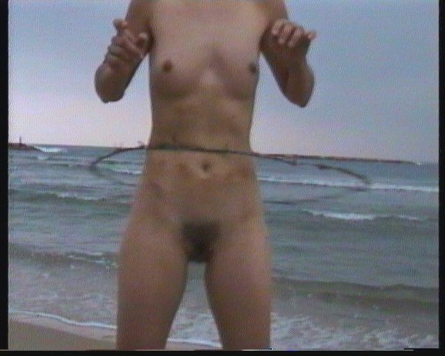
Sigalit Landau, Barbed Hula, 2001.
DVD, 1:53 mins.
Courtesy the artist and Sherman Galleries, Sydney.
[click on image to enlarge]
In the back gallery at Sherman Israeli artist Sigalit Landau has an installation of video and photographic works. In the past, Sigalit’s work tended towards some rather unlovely installation pieces that, while conceptually rigorous and as tight as a Matron’s bun, were neither as sumptuous nor as provocative as the new work. The suite of plasma screens arranged around the walls of the gallery space offer visually startling and provocative images that cycle around and around. One video reveals the artist in the Dead Sea trying to walk sideways on a spiral of watermelons floating in the water, perhaps in playful echo of Robert Smithson’s Spiral Jetty, maybe suggesting the ephemeral nature of the endangered sea. The toughest work in the show is Barbed Hula, in which a naked female torso suffers through the pain of keeping the self inflicted pain going. One cannot help but be swayed by work like this, boiled down as it is to the essence of an idea, presented so gorgeously on state of the art TV sets. Now that’s quality.
