The eternal question – where are we? We’re in Brisbane to talk to Queensland University of Technology students about careers in art writing. It’s raining and its cold and the people in the big mall in the centre of town look annoyed and feral, like a riot is going to break out. At QUT people look neater and less wild, and they are very attentive listeners. They ask perceptive questions and seem amused by the notion that writing about art is a sucker’s game – you can’t make a living out of it.
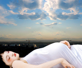
Digital art – pregnant with meaning.
The QUT event takes place in the campus art gallery and we take a gander at their digital art exhibition, The Vernacular Terrain. It’s not a very exciting show, and for some reason all the digital art has been printed out from a computer and stuck to the walls, just like old art. In QUT’s adjacent gallery space is the all-female Breaking New Ground: Brisbane Women Artists of The Mid-20th Century. The show features work by Margaret Cilento, Pamela MacFarlane, Margaret Olley, Joy Roggenkamp, Kathleem Shillam and Betty Quelhurst. Looking at the works is like taking a stroll through an old text book, perhaps something by Bernard Smith, all brown toned and sepia paintings of bunches of flowers and nudes. The juxtaposition between the two shows is slightly jarring, but a juxtaposition that’s pretty standard museum practice these days. It’s probably not fair to judge both shows by the same standards since they set out to do very different things but we come away from the digital art show thinking that it’s just as well we don’t.
The next day we head over to the Gallery of Modern Art to see if what we experienced at the opening back in 2006 wasn’t a hallucination. We remembered a vast permanent collection of little-seen Australian contemporary art in tall galleries filled with glorious light. When we get there the place is deserted and high winds howl through the sliding glass doors of the book shop sounding like the winds of Armageddon. We have to hold the edges of expensive international art magazines firmly lest they fly from our hands.
Inside the gallery proper, school groups wandered around and the permanent collection looked drab under grey light. Never mind, we thought, there was still the opportunity to see the temporary shows but one of them was the Howard Arkley retrospective touring exhibition that was featured in episode 1 of the Art Life TV series. We spent hours in the Art Gallery of NSW while shooting that show and the last thing we wanted to see was see Arkley’s thin oeuvre yet again. But always game for a reassessment we had a stroll through the show anyway and it didn’t look to bad so long as you didn’t look too long. Arkley’s strongest works – his suburban house exteriors – aren’t represented by his best examples in the retrospective and the urban tribal stuff looks as crappy now as it did back in the 1980s. We’d had some misgivings making the TV show of making Arkley’s biography a part of his artistic story, but standing in front of his picture of the disembodied arm shooting up, you had to at least concede that the artist had made the biography part of the work himself. If only there were a bit more to the story. If only the silly bastard was still alive.
GoMA’s major installation of the moment is by German artist Katharina Grosse. The blurb on the gallery’s website says that “The artist transform[s] GoMA’s long gallery into an extraordinary environment that confounds conventions of museum display and challenges our expectations of painting.” The actual installation is a gob stopper – right in the middle of the gallery’s main space, two massive mounds of dirt have been heaped up against one wall and two equally massive canvas stretchers have been stuck on top. On the opposite wall, from ground level going right up to the top floor, are a series of massive balloons. The mounds of dirt are nearly 20 meters high and the entire installation has been spray painted with various garish colours – green, red, orange and blue. The whole work is – to be blunt – about as dumb and ugly as it is possible to be. The only expectation confounded here is the notion of taste, and we’re not talking about the total lack of any redeeming painterly qualities, but the sheer impoliteness of the artist trying to pass off this hideous eye sore as a “work of art”. What a disgrace.
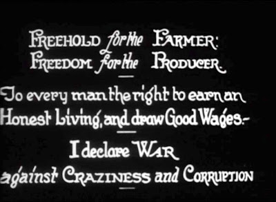
Outside the wind was even stronger as the effects of a sub tropical storm blasted bone dry Brisbane. We took shelter in the State Library of Queensland. Inside was an exhibition called Reel Rescues. Art shows in libraries tend to be pretty dull affairs but Reel Rescues turns out to be one of the best things we see on our good will tour of the art world. It’s a show of rare films made from the 1920s through to the 1970s, ranging from home movies to news reels. The set up for the show is fairly straightforward – each film is projected onto the wall next to another projection and the effect is like an exhibition of moving paintings. A discreet sound design chimes away in the background and it’s a small joy to walk around in the dark, taking a dip into the grain of the various films stocks, the twitter of Lorikeets and laughing children in the distance. Sometimes things that aren’t supposed to be art achieve the status of art through their sheer indifference to art. What a million pleasurable miles it feels from GoMA.
As we leave Brisbane, reports come in that the south east of Queensland is under water. Up above the clouds, once all the shaking of the plane passes, it is bright and lovely. The woman next door is reading about Katie Holmes and how close friends confide that she is at her wits end with Tom Cruise’s outlandish Scientological theories of child rearing. Not only that, but Katie Holmes is looking haggard while the Scientologists have built a UFO landing strip in Colorado.
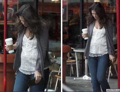
Katie Holmes: friends confide the star is close to breakdown over Tom’s demands.
A sense of profound unreality sets in as we descend back through the clouds and over the dot designated as our nation’s capital. Canberra airport is an armed camp. Federal cops are conspicuous by their presence; short, bald guys in blue jumpsuits, Glocks on hips and their arms folded sternly as they watch travelers just off the intercity flights looking for their bags. Big rear-lit pro Work Choices ads sit next to large cut away images of amphibious ships that can – according to the image – carry loads of tanks, landing craft, helicopters and assault ‘copters. It’s the logical choice says the advert.
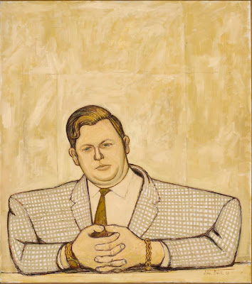
John Brack, Portrait of Kym Bonython 1963.
Oil on canvas.
Collection: National Portrait Gallery.
Canberra Gift of Kym Bonython AC 2007 © Helen Brack
We’re in Canberra to open the John Brack show at the National Portrait Gallery. Our brief is to talk about Brack’s relevance today. The crowd is huge for the opening – four hundred punters crowding around inside Old Parliament House, glasses of excellent merlot being quaffed as various art world, business and social luminaries greet each other. How are we going to explain that John Brack’s work is still relevant, indeed, has always been relevant? We remember our high school art text book – the one written by Kim Bonython – and Brack’s Collins Street 5pm picture staring out at us from the page. No one could have mistaken that image for anything other than art with texture, with history, with an eccentric and idiosyncratic vision. That seems like contemporary art to us, no matter when it was made.
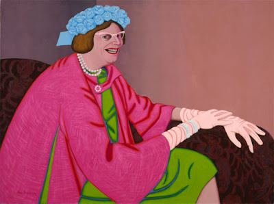
John Brack, Barry Humphries in the character of Mrs Everage, 1969.
Oil on canvas.
The exhibition itself is a beauty. The halls of the NPG are hard to hang works in, but their fusty atmosphere seems perfect for the weirdness that is Brack en masse. His work is reminiscent of graphic art of the 50s, and of Warner Bros. cartoon backgrounds in particular. It’s the black line over green and brown that does it, a sensation rather like the distant ringing of an alarm bell from a bank robbery gone wrong. Brack’s portraits have unexpected echoes – his portrait of Bonython for example is eerily reminiscent of Philip Guston, the lines of the plaid jacket looking like a bag full of oranges threatening to burst, his portrait of Helen Brack recalling Grant Wood and James McNeill Whistler while the acidic portrait of Mrs Edna Everage have little indications within the orange and green folds of the dress the later work of Arkley. Yep, it’s all there.
Contemporary art is obsessed with the meaning and agency of the art object – how it relates to the world and how the art object transmits meaning to an audience. In a lot of contemporary art the idea of the work, its subtlety and nuance, gets lost in that obsession. Brack’s work offers a multi-layered meaning, one that contains humour and irony and deftly deploys those qualities within a painting, that much valued and vaunted of all art objects. Brack’s irony always set him apart from the angst and sincerity of Australia’s expressionists, and if his lack of wins in the bog standard art competitions of the day is any measure, he wasn’t hugely valued by the establishment either. Irony is now in plentiful supply but its cheapness has also devalued its bite. While you can find irony just about anywhere from American sitcoms to redundant political ads, but it takes a real skill to use irony to its richest and fullest variety. It’s a difficult notion to express but if artfully done seems as simple and natural to understand as the act of looking. Brack’s work has it and its effect is like falling into the pull of a giant magnet. You may not like it but it’s mesmerizing.
