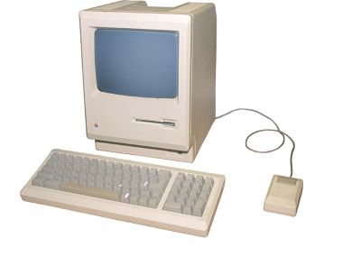
Good for graphics, apparently…
What’s wrong with you? There’s nothing wrong with us, what’s wrong with you? And so it went, back and forth between readers and time poor Art Life staff members. A reader wrote to us:
For months now the contrast between the text and background on your site has made the text impossible to read. While the vastly increased number of images were a nice addition several months ago it is really the words that makes your site appealing. Can this contrast problem be fixed?
While we do indeed work overtime to make our words “appealing” we suspected that this email was the web equivalent of ringing someone up on the telephone and asking them if their fridge is running. Of course it’s readable! What were they talking about? After some back and forth it dawned on us that not all readers of The Art Life are using a PC, or Internet Explorer.
There are some problems for people who use Macs and browsers such as Safari. The page layout appears to be jumbled and downloads the page in a rather haphazard manner, making it appear as though the page is black text on a dark grey background. Safari has also been known to skip picture downloads. Why does this happen? A better question is “why does anything happen on a Mac?” and the answer is – who knows? – they’re “good for graphics” but shit for eveything else. Some PC users using Firefox see the blog at a reduced scale and need to enlarge the type, which is annoying, but only takes a second of your time.
The Art Life is best viewed on a PC using Internet Explorer or Firefox. They can be downloaded for free.
