For visitors to Melbourne the Australian Centre for Contemporary Art seems formidable. Although it has cousins elsewhere such as Artspace in Sydney and the IMA in Brisbane, ACCA’s rusting metal casing, the bizarre blinding of visitors in a foyer where those entering or exiting literally cannot see, and equally foreboding reputation as a serious gallery fills the visitor with trepidation: you may not like whatever you see there but ultimately it will be good for you. With the departure of former director Juliana Engberg [who has left the country to travel Europe in search of ideal soft furnishings] new director Max Delaney has seemingly turned down the programming to more approachable offerings. A show of contemporary painting? Sounds like a great idea.
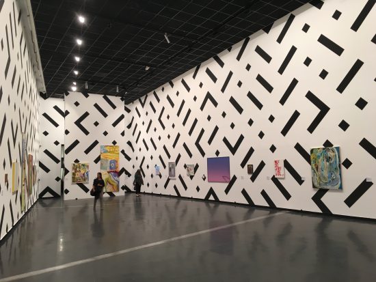
Sam Songailo, Sorry to kill the vibe but time does exist, 2016. Wall painting.
Hang on a second buster. Painting, More Painting isn’t such a straightforward proposition. It turns out that it’s part two of an ambitious project to “…explore the pictorial logic and medium condition of contemporary painting to examine the ways in which artists continue to reinvent painting within strict limitations, and in response to new perceptual conditions brought about by the advent of digital and virtual realms.”
You’ve heard of the internet, and you’ve heard of post painting, so this show sets out in a rather complex way to bring together the work of painters whose work in some way reflect the curatorial premise – although interestingly, and according to a source close the Melbourne art world, Painting More Painting was put together by drawing on a plethora of private and gallery collections some without the consent or knowledge of the artists. My sources also tell me that some of these artists were none too happy about not being asked, and that paintings they considered to be lesser works ended up in the show. We can put the first complaint down to an artist’s typically overinflated sense of entitlement – yes, it’s nice to be asked but strictly speaking works owned by private and public collections no longer belong to the artists, ergo, sit back and enjoy the publicity – while the second issue is more interesting – if they are indeed lesser or atypical works then you have to wonder how the selection illustrates the premise – maybe the painters will have to accept that they don’t get a say in what their work is supposed to mean either? While probably just gossip, the show itself puts the relationship between curatorial premise and approach, the intentions of the individual artist and how the work is seen in the final show into an interesting light.
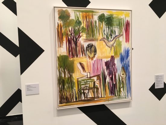
Ken Whisson, Bush recollections with houses and faces, 2013-14.
Entry into the first of the exhibition’s two galleries – the ‘panorama’ selection – is actually quite exciting. Look in there – there’s a whole lot of new and recent paintings! The first gallery is filled with paintings hung on a painting, that is, the entire wall from floor to ceiling looks like dazzle ship camouflage, courtesy of Sam Songailo. According to the curatorial blurb “At once geometric and digital in appearance, Songailo’s mural serves as a spectacular mesh within which a range of diverse painterly positions are presented. Its open-form gridded structure also suggests patterns of connection and dialogue that contemporary painters share as colleagues, their critical relation to art historical frames of reference, and the elaboration of new aesthetic potential”. The wall text also includes a quote from the artist: “I decided I wanted to make my work inescapable and ever-present. Instead of having to mentally project into the picture plane visitors to the show would be inside the painting.” Well, it works on both counts, it does suggest pattern and connection, and yes, it is inescapable. Clearly someone thought this was a good idea – and it probably was on paper or in mock up – but as a visual experience for an actual visitor it has the effect of both uniting all 30 paintings hanging in gallery one and obliterating their individual content – just like the web I suppose, but hardly the ideal curatorial approach.
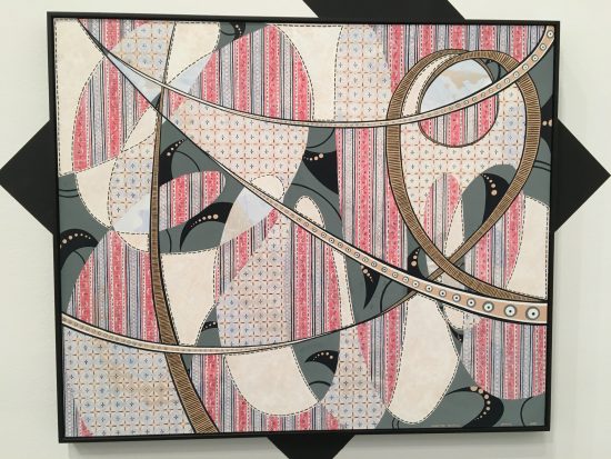
Elizabeth Pulie, Signature Painting, 2008.
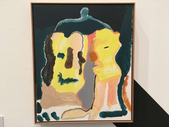
Tom Polo, Side Talk, 2014.
Oscar Perry, Bad things come easy / poke and a mop, 2013.
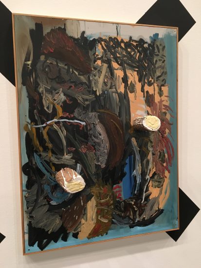
Among the madness of this black and white Tetris, individual paintings more than hold interest: Ken Whisson‘s Bush Recollections with houses and faces [2013-14] is a classic work by the painter, its restraint in its line work complimented by a composition that leads the eye around the surface. Likewise Elizabeth Pulie‘s Signature Painting [2008] constructs a dense layering of pattern inside what look like the arabesques of a Spirograph pattern. Is it ok for me to mention Tom Polo now? It’s been ages. I will anyway – Side Talk [2014] does that switch between abstraction and figuration thing that Polo does so well and the painting looks as much like a coloured Rorschach test as it does two people doing chit chat. A stand out work for me was Oscar Perry‘s Bad things come easy/poke and a mop 2 [2013] – a very good bad painting with two logs stuck on that looks a lot like a bad mannered version of the painting by Stieg Persson that’s hung right next to it.
This is the same exhibition…
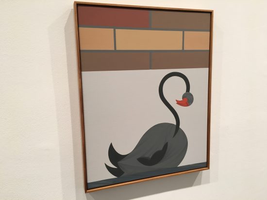
Mitch Cairns, Geranium Pots, Swan Classic, 2016.
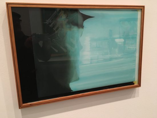
David Jolly, from the Before History series, 2009-10
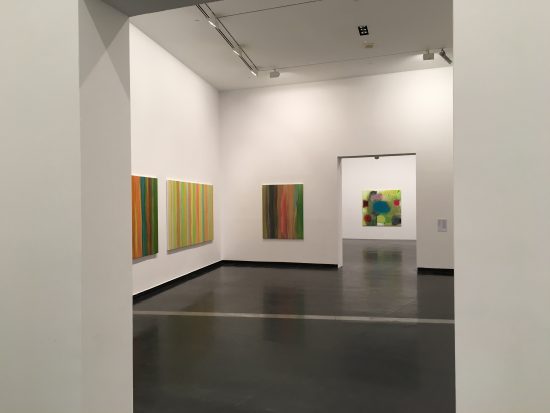
The second of ACCAs two galleries wasn’t named but offered a selection of works by Teresa Baker, Angela Brennan, Mitch Cairns, Diena Georgetti, Matthys Gerber, David Jolly and Karl Wiebke. Nor was its walls painted other than the usual art gallery white. The disparity between the two spaces – one with its high ceilings and black and white pattern and line up of pictures – the other with low ceilings and comparatively sedate hang – seemed like two entirely different exhibitions. Works by Brennan, Cairns and Georgetti are hung in the first room that make for an interesting comparison- the diffuse and rather lovely colours of Brennan contrasting with the highly structured work of Georgetti, and Cairn’s studied minimalism somewhere in between. The middle room comprises a stark contrast between the intense pattern and colour of Baker’s trio of landscapes, and Wiebke’s gorgeous vertical stripes. The final room – Jolly’s mysterious paintings on glass set opposite Sydney’s own ‘Melbourne artist’ Gerber and some signature abstracts – rounds out a wholly confusing and at times invigorating exhibition.

Thanks for the review. Keen to see the exhibition