Ian Shadwell continues his stroll down through Martin Place and into the precincts around Australia Square – and the wealth of first rate art prompts our flâneur to exclaim “Thank you, Mr. Seidler!”
To his ever lasting credit, Harry Seidler thought that grand buildings deserved excellent art. His attitudes contrast sharply with those of many local developers to this issue, who fulfill their requirements for providing public art with cynical half-arsed pieces of shit that actually detract from the environment rather than enhancing the urban experience. But more of that once we hear from our lawyers.
In the meantime we are here to celebrate, not to whine and there is much to celebrate in three of Sydney’s iconic Seidler buildings – Australia Square, the MLC centre and Grovesnor Place.
Today we’ll have a look at Australia Square and The MLC centre.
Photo: MattyP, via Flickr under CC License
Australia Square
For those who enjoy the Modern, Australia Square is a dreamy phallus of perfect proportions. Like most of Seidler’s buildings it has been sweetly framed by its footing which include “the square” and the smaller rectangular lines of the building on Pitt street. Its a setting which invites you to approach the tower in a manner that gives the various elements of its construction a harmonious gestalt. The rigorous Modernism is softened by organic lines, with the ceilings and fenestration exhibiting honeycomb motifs that extend throughout the design, whilst the circular shape itself is both inspired by nature and reminiscent of a Renaissance campanile.
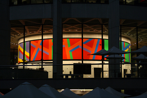
The foyer is superb, almost sculptural in its dynamic use of the circular form. The area above the lifts, on the central service tower was once adorned with tapestries by Le Corbusier and Victor Vasarely though, sadly, these have been removed due to conservation issues. Presently a magnificent So Le Witt mural accentuates the space superbly, complementing the design with a surreal geometry.
Outside we have a playful Seward Johnson work, Waiting, which riffs on the nature of the building’s clientele, though perhaps an updated version would have the figure touting a Blackberry rather than a newspaper.
Undoubtedly, the most delicious and substantial work is the Alexander Calder piece “Crossed Blades”, a monumental sculpture in black steel which sits at the building’s north western corner facing George street. The black steel “blades” of this work exhibit a logic contrary to the calm minimalism of the building, clawing at the air, like a spider’s legs or the branches of a Morteon bay fig. It is at once nightmarish and playful, a strong example of one of the masters of the New York school and a welcome addition to the city’s street-scape.
MLC centre
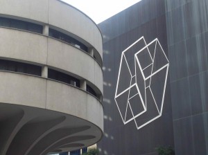
Though Australia Square may well be the better building, I have always enjoyed the MLC Centre more, principally, due to its dramatic mix of elements. Approaching from Martin Place, the combination of the circular form of the Commercial Travellers Club, with the the rigid op art puzzle of the enormous Josef Albers work Wrestling on the facing wall creates an extraordinary space, which is almost sculptural in its harmonies. Seidler has accentuated these ideas with a series of circular tiered plazas, which echoes the principle motifs of the building itself, as they lead to the foyer.
The foyer itself is a relatively unassuming affair after the grandness of the entry from Martin Place, yet it has a quiet, beautifully balanced charm in which is situated a number of outstanding works.
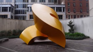
The yellow ‘S’ sculpture by Charles Perry is simply one of the finest pieces of public art in Sydney. A magnificent steel sculpture which complements the space perfectly. The “soft physics” of its form suggest a geometry of aesthetic idealism, in which the curving volume of the yellow ribbon offers a continuously varying composition as you circle it.
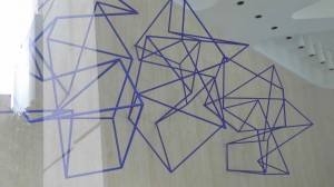
The wall hanging sculpture “New Constellation” by Robert Owen, in the foyer, uses a delicate steel tracery of an intense Yves Klein blue that creates an inward rush of the eye making the space within and around the work do unusual things. Its a satisfyingly hypnotic piece which references the Seidler’s own interest in space in an elegantly intense counterpoint to the interior and the Charles Perry work outside. Though, its position above an escalator tends to undercut its enigmatic qualities.
Robert Owens is also responsible for the six panels in the southern Castlereagh street entry, Spring: Double Weave a large scale gridded tonal work that uses scale to great effect, creating a shimmering warmth that contrasts nicely with the rigidity of its composition.
Make sure you leave by the Martin Place foyer and take a few moments to admire the Albers work, Wrestling. Most particularly if you have been lucky enough to visit the AGNSW and seen his Hommage to the Square that they have there. One of the principal teachers at Black Mountain college, Albers instructed artists such as Robert Rauschenberg, Cy Twombly, Ray Johnson and Susan Weil, as well as himself being a student at the Weimar Bauhaus. His CV is truly heavy weight. Wrestling is beautifully situated, above the forecourt and “communicates” in an intriguing contrast with the other elements of the space. Its a massive piece yet perfectly scaled to the situation. A wonderful example of how public art can work to “illuminate” a space.

Thank you for this article. Each year the Sculptors Society exhibits in the foyers of both these buildings and it is so nice to see our art interacting with these giants of art and architecture. Incidentally as there doesn’t appear to be a notice showing Charles Perry’s name near his beautiful S Sculpture and several of us concluded that it was actually a Meadmore piece. Thanks for clearing this up.
Thank you for this article. Each year the Sculptors Society exhibits in the foyers of both these buildings and it is so nice to see our art interacting with these giants of art and architecture. Incidentally as there doesn’t appear to be a notice showing Charles Perry’s name near his beautiful S Sculpture several of us concluded that it was actually a Meadmore piece. Thanks for clearing this up.
Pleased the article was helpful. Yes, it certainly, looks like a Meadmore. Have you seen the “hidden” Meadmore on top of the AGNSW? I think there might be a movement to have it placed it outside of the MCA so it can be seen more readily.