Ian Shadwell takes us on a walking tour of Sydney’s hidden public art. First stop – Martin Place…
Much of Sydney’s public art is execrable. Whether this is a result of poor taste, cynicism or a failure of supply is hard to know, but when you compare it to similar cities in Europe or even our delightful southern sister, Melbourne, there can be no doubt that we’re missing out. But that is not to say that there aren’t gems worth a side trip to stand dumbly in front of for a few moments, whilst busy 9 to 5er’s bustle by. Over the next few weeks, I’ll be taking some time to point out a few that are worthy of mention, be it for their quality or their failings.
To begin with, I’ll be taking you to Martin Place station, just under the pristine marble modernism of the Reserve Bank building into the bowels of Martin Place train station, a late Modern, almost Po-Mo, not-really-anything-at-all space, which has very little to remind you of the grandeurs of the Moscow subway or even the charm of the Parisian metro but is instead, the kind of bland mass transport space that makes Sydney so very distinctively like every other modern city. Yet, its not all easy to clean surfaces that are rarely cleaned. If one was to look up to your right or your left as you were swept along by the rush hour tide, you would see either one of a diptych by Portugese artist Teresa Magalhães.
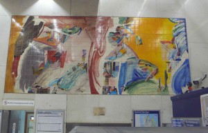
Gifted to the city of Sydney by the Lisbon Metro system, (who, it appears, place a high value on the importance of public art) the works are “paintings” baked on to the tiles of the wall. A kind of painterly mosaic if you will. the first work is called, reasonably enough, Sydney I, and is, in the words of the artist, as inscribed on the brass plague beneath it…
“A lyrical abstract response to Sydney as it was when Europeans first arrived. It is a simple natural landscape filled with strong colors reflecting the sun, the earth and the sea and filled with the promise of a nation’s future”
Fine thoughts indeed and, when it comes to abstract work, it is always somewhat of a relief to know just what it is exactly that you’re dealing with. Stylistically it has that mannered vigor familiar to us from the Po-Mo/Modernist crossover, albeit, rather late, given the work was finished in the late Nineties. A touch Colin Lancely, with vivid pastels in loosey-goosey gestural scrawls that mark out trees, headlands, harbour and sky. Its a pleasant composition, which is at once energetic and harmonious. Yet, the painting’s flatness and the transparency of its glazed colours cause it to recede into the background of this busy commuter hub, barely noticed by the tens of thousands of people that use the station.
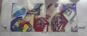
Sydney II faces the first picture across the busy concourse. Here is a description of the painting, in the artist’s words:
“In contrast to Sydney I this shows Sydney as it is today. The rustic bush scene is now cut by broken lines, ancient and modern buildings mix together to form a musical piece of harmonious and strident sounds. The opera house plays a key role, softening, the masculine images and giving the city back her feminine soul.”
its overall harmony, its musicality, causing it to fade, like the other work, into the background of the cities hub-bub, melding with the slightly grimy tiled surfaces of a major metropolitan train station.
Perhaps next time, you’re rushing through Martin Place on your way to where ever it is that you’re going in your busy hurly burly life, you might take a moment, and look at these two works.
And there it sits, surrounded by air conditioning vents, a security camera and a bundle of redundant electricity cables that hang loosely from the wall at the paintings bottom right hand corner. Here then is the “nation’s future” as described in the commentary of Sydney I. Beneath it people rush by oblivious, to the vigorous, tense, complex composition above them. Its actually not a bad painting at all, balancing a frenzy of elements and colors across a large scale surface. Indeed, perhaps it is in a sense too successful,


I rarely get the train but will make an effort to go down and have a look. It looks like a bit of bright colour and life in an otherwise dull space. Thanks for bringing it to our attention.
This comment breached The Art Life Terms of Use and has been deleted.
Why is it that new public art is generally awful whilst older works a charming and seem to fit into a city. Is it just the mellowing effect of time or has art gone to the dogs.
Is it that in finding permanence these gems are drowned in the hubbub?
I once thrilled to certain pavement artists in Sydney and those rare buskers in Central Tunnel who could stop you in your tracks with their riveting expressions but whose collective fate it was to be washed down gutters or moved along by greater forces. I found their philosophical acceptance of the impermanence of their artistic endeavours almost as moving as their unique talents.
Perhaps Mr Shadwell might enjoy this link:
http://www.artsjournal.com/realcleararts/2010/05/dilworth-times-square.html
There aren’t too many examples of public art in Sydney CBD but there are a few gems hidden away. I had no idea these pieces were even art!