Friday Degustation: serving suggestion only
It’s Artichoke Season in Venice
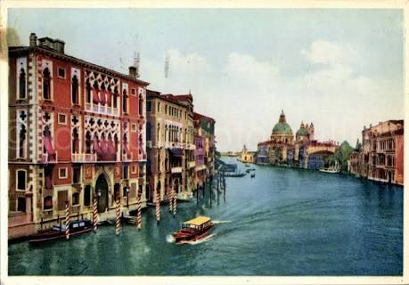
The Venice Biennale is the leading international contemporary art event, and one of the oldest. Its name conjures up both prestige and quality, and although the event itself is an isolated series of exhibitions and national pavilions surrounded by the crush of European summer tourism and an array of dodgy unofficial and unaffiliated exhibitions hoping to cash in, who gets shown, and what gets picked as the winners, or favourites, is still a big deal. A nod from the Biennale, an award for best in show, means that all the money and effort that went into taking the work there was worth it. Hell, just a write up in an international art magazine can be enough.
Happily, the Australian pavilion got the nod from Artsy.net‘s Casey Lesser who proclaimed it one of the ten best [>] “Anjelica Mesiti wanted to turn the Australian pavilion into a site of democracy and community. Her three-channel film plays around a red-carpeted, mini amphitheater, where visitors can sit side by side, and take in the captivating work. The film uses music to address the flailing state of democracies globally—particularly, the cacophony of conflicting voices and viewpoints. Filmed in the plush senate chambers in Italy and Australia, the piece encourages listening and harmony, through becoming attuned to the ways that we communicate…”
Mind you, getting art critics to agree on most things is a difficult task, let alone the best at Venice. At Frieze, Evan Moffatt, in The Art of Getting It Wrong – 58th Venice Biennale: The Best of the Arsenale Pavilions, reflected on the difficulty of simply finding things in the city [>] “Venice is a place where you find what you least expect yet lose what you most took for granted. Or so a friend told me the other night, after we had wandered through a maze of alleys and sottoporteghi for days, circling in mad loops around pavilions with unlisted addresses. If you feel self-assured, the city will doom you to failure: you simply can’t fight the tide (or the mysteries of Italian scheduling).”
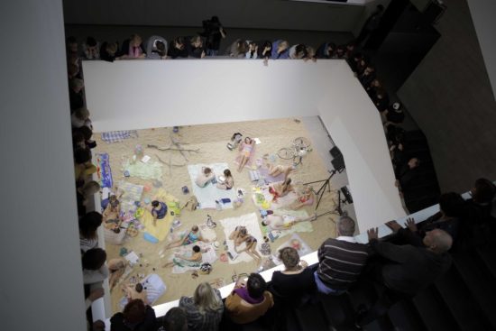
As it happened, Australia’s pavilion was not mentioned, but neither was Lithuania, the pavilion that took out the Gold Lion, the much coveted prize for best in show. As the New York Times reported [>] “An opera performance on an artificial beach, in which swimsuited performers break from sunbathing to sing warnings of ecological disaster, won Lithuania the top prize on Saturday at the Venice Art Biennale, the world’s oldest and most high-profile international exhibition of contemporary art. “Sun & Sea (Marina)” — presented by the artists Lina Lapelyte, Vaiva Grainyte and Rugile Barzdziukaite — took the Golden Lion for best national participation at the Biennale, beating 89 other national pavilions. This was the second successive time the prize has gone to a performance piece: In 2017, the winner was the German pavilion, for Anne Imhof’s haunting “Faust.”
Art.net sang the work’s praises: [>] “So much art about climate change is bad. It’s preachy, literal, unimaginative, and hung up on aerial shots of floods or topographical maps. By contrast, Lithuania’s pavilion at the Venice Biennale, titled Sun & Sea (Marina), is a revelation. It is a chilling work about climate change that is also an opera about a day at the beach. Unlike most works about climate change, which attempt to scare you into action but often simply paralyze you with the vastness of the problem, this performance sinks in by focusing on the mundane. “It’s about nothingness—nothing is happening,”Grainyt? said. A cranky woman complains in song that nobody cleans up their trash or their dogs’ poop; a wealthy mother brags about seeing the “bleached, pallid whiteness” of the Great Barrier Reef and how excited she is for her eight-year-old to see it; a young man complains that it did not snow on Christmas, and instead “felt like it could be Easter.” “The piece has to do with ecological issues and the Anthropocene,” Grainyt? said. “But I didn’t want to be didactic because it’s such a big topic and it was important to find a subtle, romantic language.”
The Art Newspaper took a slightly different tack with its coverage of the Biennale, including both a best of list, and a worst of . As we noted above, there’s some dreadful art at Venice around the Biennale, and some inside it. Christina Ruiz noted that [>]“In the official Venice Biennale at the Giardini it is a particularly bad year for national pavilions. To be sure, there are some notable exceptions but they fall outside the scope of this article. Here, let us turn our attention to Romania: a giant puddle on the floor with some washing machines in one corner. Then to Egypt: an imagined Pharaonic tomb that looks like a reject film set from Liz Taylor’s Cleopatra complete with a row of sphinxes with video screens on their faces. Then to Russia which is curated this year by Mikhail Piotrovsky, the director of the Hermitage Museum in St Petersburg, who has asked artists to respond to works in its collection and has produced a show that amounts to a massive advert for his own institution.”
However the worst according to Ruiz was a context free art work [>] “But the most troubling display at the Venice Biennale is elsewhere. Christoph Büchel, the Swiss-Icelandic artist who turned a disused church into a mosque as Iceland’s contribution to the 2015 Biennale, has transported to the Arsenale a damaged fishing boat that sank in the Mediterranean on its way from Libya to the Italian island of Lampedusa on the night of 18 April 2015. Between 700 and 1,100 refugees died on board this ship which now stands in silent testimony to Europe’s indifference to the migration crisis and our completely inept handling of it.”
And for those made jealous by the stream of Venice images in your social media feeds from friends in Italy, and feel that missing Venice in 2019 is the ultimate art world FOMO, writer Kate McDonald noted on her Facebook page a vignette that reminds you what travelling to the fabled city in summer really means: [>] “At a 11 Euros these are $20 coffees. Johnathon just had to do it, me, I’m along for the ride. I’m watching a family of four spend about 200 euros on some chips, coupla muffins and drinks.”
Fake Fake Fake
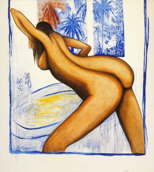
It’s kind of surprising that 27 years after the death of Brett Whiteley that a catalogue raisonne of the artist’s work hasn’t already been compiled. The late artist was hugely prolific across a range of media including painting, drawings, works on paper and sculpture, and putting together a comprehensive catalogue would no doubt be a difficult task. And has been widely publicised – and fought out in court – when an artist of Whiteley’s stature dies, and the value of his better works in the secondary market now tops $1 million, there have been a slew of fakes and forgeries brought to light. Now Melbourne art historian Kathie Sutherland is about to publish the 2400-page Brett Whiteley: Catalogue raisonné: 1955-1992 and some of the contested works are not included. As The Age reports [>]: “Forgers introduce fakes into the market under the cover that Whiteley traded art through the “back door” to make quick money for a hit, and that Wendy couldn’t possibly know everything he created. For this reason, Ms Sutherland’s catalogue, which itself costs a small fortune ($1500) and is being released by Melbourne publisher Morry Schwartz, will be a decisive checklist for buyers and dealers. But the catalogue will not be without its own controversies as authenticating art is a fraught business. “Brett was such a prolific artist that there is just no way that I will have captured everything,” Ms Sutherland says. “I will keep updating my records as new information comes to light. There will be things that pop up that I don’t know about today.” An addendum will eventually be created and Sutherland envisages publishing it online. “It’s an incredible reference,” Wendy Whiteley says of the upcoming publication. “In the future when I am not here and Kathie is not here, it will be very helpful. There is a huge industry in making fakes.”
In The Night Garden
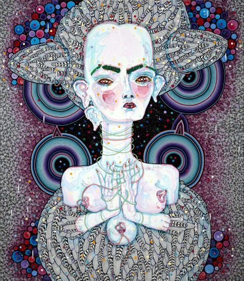
Sarah Darmody really likes the work of Del Kathryn Barton, so much so that she has written an ode to it, suitably titled From the miracle of motherhood, an ode to Del Kathryn Barton in Nine Media’s The Age, in the Motherhood section. Darmody begins in manner that suggests the author might be sleep deprived: “Night-time in the nursery is not the place of soft quiet I imagined it would be. It is a surreal place where countless reflective, glitter-inflected eyes watch as you fall in and out of another human being’s first reported experiences of the subconscious realm.”
It’s not so much that Darmody really really likes the work, and senses a connection between her own experience as a mother and the experience of the artist, but rather, Barton’s paintings are literal depictions of … uh… translucency: [>] “In these time-resistant hours, I recognise myself too keenly in Del Kathryn Barton’s pale, long-limbed figures, witnessing the translucency of my own mind and body rendered nearly borderless, worn thin and mutable through the forces of expectations and sleep deprivation. When my daughter was in utero, I was an impervious, unrelenting galaxy for this firstborn wonder of mine, but now I see myself reduced from that tranquil impartiality into a worldly creature: a shamanistic figure, powerful and terrible, multi-eyed and sharp-toothed as any of Barton’s creations, as I try to insist on a path back from nonsensical night terrors to the world displayed in picture books around the room. The colours are Barton’s colours – not unreal, just unfiltered, like my daughter’s dreams, where taxonomic rules are suspended. The colours of bruised berry juices, butterfly wings, snakeskin and lorikeets fall preternaturally together…”
“Drawing a wire in space…” Banyard’s Blue Ridge Moon
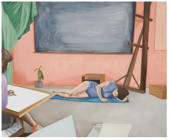
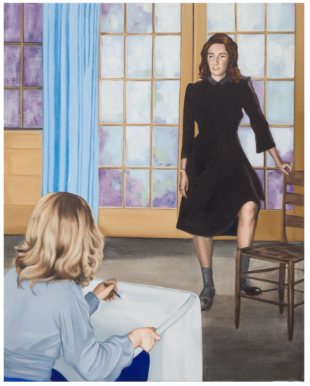
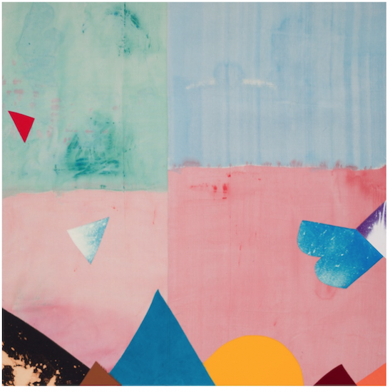
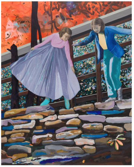
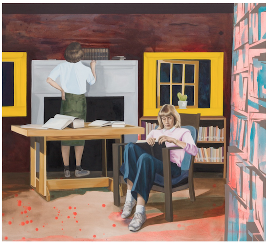
Artfully timed to coincide with the inclusion of work at the Museum of Contemporary Art in The National, Kylie Banyard has just opened Blue Ridge Moon, a new suit of works at Galerie Pompom. Continuing the artist’s interest in using archival imagery, first hand experience and imaginative speculation to connect the utopian dreams of the past with future possibilities, Banyard extends her work into abstraction, and the seductive painterly surfaces of reworked images. She threads together texts on the Black Mountain College to accompany her work: [>] “At the end of June, we packed our brushes, paints, jeans, bathing suits, one good suit for him and two dresses for me and took off for Asheville on an overnight train. The thing that holds Black Mountain together is that they are building their new buildings with their own hands. It is a great sight to see the trucks go down the mountain every afternoon filled with teachers and students, boys and girls. It is something hard to describe in words, I helped on the wall one afternoon and felt happier at the end, more whole and ready for thought than I have in years. The College without locks and keys, without prerequisites and administrative regulations, was also like an open dish in the universe. It allows ideas, like particles or spores, to fall into it. I learnt and saw with my own eyes that the passionate pursuit of ideas and meaning was life-fulfilling. The school activities engulfed us like a warm breeze. Anasis Nin, who was printing her own books in NYC, came to help us set up our print shop. Drawing in wire in space to create air volumes, the farm looks well, it was fun to see it change with three seasons. It was a relief in the fall with the different greens of winter wheat, rye and barley cover crops replacing the tired silage corn and soy-bean stubble. The excitement and energy released in the ritual of harvesting the corn gave magic to the hard physical labor taking place in the sun, making the work seem effortless.”
Not just an artists initiative
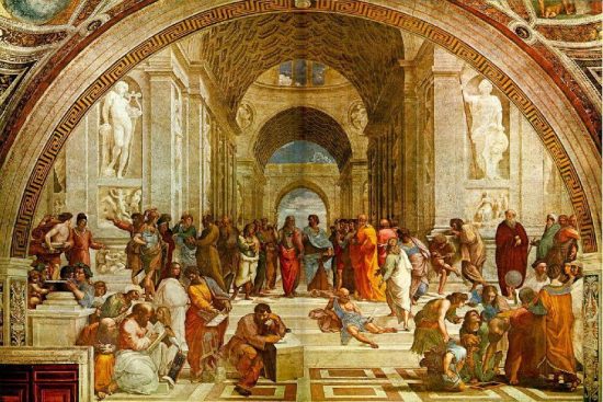
When the Australia Council for the Arts library was about to be dramatically deaccessioned [library talk for throwing out the books], the fledgling community arts group [>] Frontyard Projects came to the rescue. Since taking on the collection and housing it at its Marrickville, Sydney HQ the resource has become a valuable addition to both community and individual research. The story of Frontyard and the OzCo library is the fascinating subject of Michelle Kelly‘s essay Library in Bloom: the disintegration and regeneration of a book collection. [>] “The new incarnation of the collection as a non-lending library maintained by a small arts organisation and supported by volunteers is a future that would have been hard for anyone connected to the library during its Australia Council days to imagine; when the collection was a different kind of special library to the kind it is now. Special libraries run the gamut from medical libraries to music collections, from parliament to prison. The category encompasses art libraries and the libraries of government agencies, collection types which intersect with the lineage of the Frontyard library. These examples are from Peter Biskup (uncatalogued), and from him I learn that an important characteristic of special libraries is that they are ‘are particularly vulnerable to reduced funding when their parent body runs into financial difficulties.'”
We care a lot

Artworldwomen.com has an interview with Natalie King, described as ‘a visionary thought leader, curator, writer and cultural producer’. The interview by Claire Bridge covers a range of issues relating to curating in a contemporary, international context, including changing roles and relationships, the ethics of curating and the changing nature of arrtsitc collaboration, and kicks of with a discussion of the meaning of the word itself:
CB: I’ve heard you speak of the word ‘curator’ as originating from the term “to care”. What does this mean for you in your role as cultural producer, curator and writer? How does this understanding inform how you work and shape your relationships with artists, communities and institutions?
Follow: #brutalism
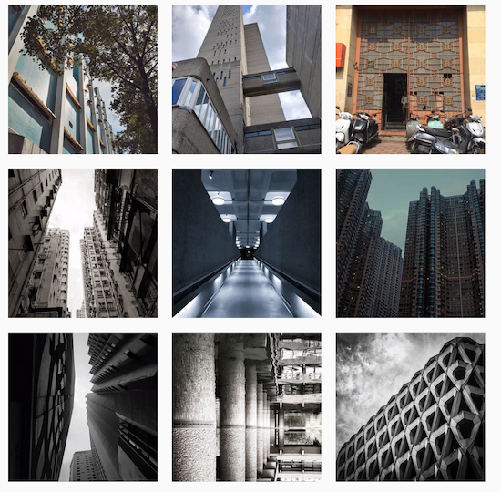

The Instagram browsing experience can be a fairly tedious slog through the ‘little moments’ of the lives of friends and distant acquaintances alike. One way to defeat the tedium is by following hashtags and if, like us, you’re a fan of architectural brutalism with all those millions of metric tonnes of concrete, acute angles and forbidding surface then #brutalism and its variants are the tags of choice. Given that the sequence of images comes from many thousands of contributors the quality can vary, and go wildly off topic [Japanese wedding photos? A band called Brutalism? ok!] yet the effect overall is weirdly calming, and fascinating.
Assorted Links
- RIP [>] Evan Williams
- Japanese company releases a range of [>] Miniature Furniture for Cats
- Lee Krasner’s huge contribution to abstract expressionism was overshadowed for years by the work of her husband, Jackson Pollock. One the even of a major show in London, her legacy is reassessed: [>] Reframing Lee Krasner, the artist formerly known as Mrs Pollock
- [>] Has Banksy painted a new mural in Venice?
- Notre Dame could provide energy for Paris with a new roof [>] and would also house a garden which would provide fruit and vegetables, if proposed design is accepted
- Lost Collective’s [>] Beauty in ruins: the wonder of abandoned buildings – a photo essay
- Frank Gehry might be best-known as the architect behind the Guggenheim in Bilbao, but he also designed a little house in suburban Santa Monica. The house looks like it was cobbled together from bits left over from a construction site: [>] The houses that architects build for themselves
- LA Museum opens new exhibit of [>] Dystopian Vehicles From Movies Like Blade Runner And Mad Max: Fury Road
- Laboratory tests revealed “sensational” discovery that the figure in Vermeer‘s ‘Girl Reading a Letter at an Open Window was overpainted decades after the artist’s death [>] Hidden Cupid resurfaces in one of the artist’s best-known works after two and a half centuries
- Shadows from the Walls of Death (1874) was a visceral book warning about the perils of arsenic pigments in wallpaper, but included many actual samples. A lethal book to handle, virtually all copies were destroyed. [>] Safely view a surviving copy here
- In TIMES SQUARE RED, TIMES SQUARE BLUE, Samuel R. Delany describes the subculture of movie theatres in the 70s & 80s. [>] In the movie houses, sex was not furtive; it was enjoyed openly and without fear…?
And finally…
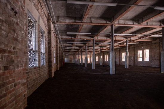
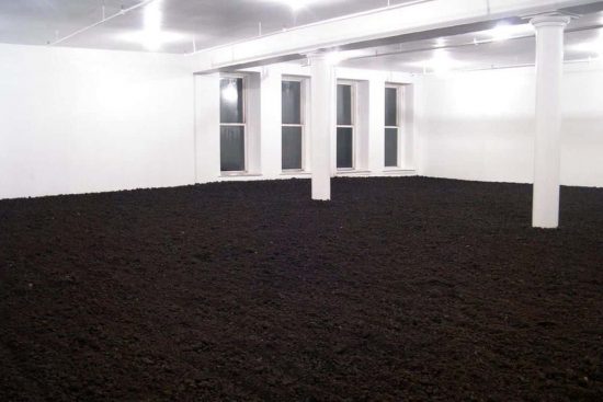
Is Asad Raza‘s earth filled room – titled Absorption [above] which is about to conclude its run as [>] Kaldor’s latest project on May 19 at Carriageworks – better than Walter de Maria‘s Earth Room [below] that’s been occupying a loft space in New York since 1977? Answers on a postcard.
