Some galleries are really hard to find. Although you might have the address written down, a UBD street directory and more than a passing knowledge of the neighbourhood, they remain invisible. Such was our problem looking for Wallspace Gallery at 25 to 27 Brisbane Street in Surry Hills. The street begins at Oxford Street [just up from Whitlam Square], runs down hill where it meets Goulbourn Street, then snakes around the Police Centre before it meets Commonwealth Street. Easy? No. We walked back and forth, up and down, asked a man on the street, walked around a few more times and nearly gave up. Then we saw it – a beautifully appointed gallery with generous wall space, polished concrete floors, subdued lighting and gentle music wafting out the doors.
Wallspace Gallery opened in March and is the baby of artist Cathy Linsley and her hubby Alex Proyas, he of The Crow, Dark City, Garage Days and I, Robot fame. In their promo email the couple said that the gallery is “situated on the ground floor of a 19th Century brick warehouse, now known as the Meta Apartments, designed in collaboration with Philippe Starck.” Showing at the gallery is Catherine O’Donnell who does some very exact works in charcoal of noire-esque locations that feature cinematic lighting effects and heavy chiaroscuro. And they’re kind of OK too. We did the once around the show, read the room sheet and were out the door in 10 minutes.

Catherine O’Donnell, Staircase 1, 2006.
Charcoal on paper, 100×75 cm.
Courtesy Wallspace Gallery.
Back on the street we realised we couldn’t see the gallery because we didn’t expect it to be there. In our minds, Brisbane Street still looks as it did in the late 1980s, a forgotten stretch of inner city nothing. The place still looks more or less the same, but it has had a good polish, everything nice and clean, just like Montreal, a stand-in location for American movies. You can go to the gym, have a coffee, see some art, browse a book shop. It all looks good. Nice.
Of course we don’t have to tell you that space is at a premium. Sky high rentals are driving artist run galleries out of town and even new commercial start ups need a shed load of cash before they can begin. It has been suggested to us by some smart people that what artists need to do is adapt to these changing circumstances, to find some niches in the cold commercial ecosystem where life can grab a hold. Benedict Ernst has an installation called The Chocolate Revolution down at Rawson Place in the window boxes of the McKell Building. It would seem that Ernst’s project is the perfect example of making do.
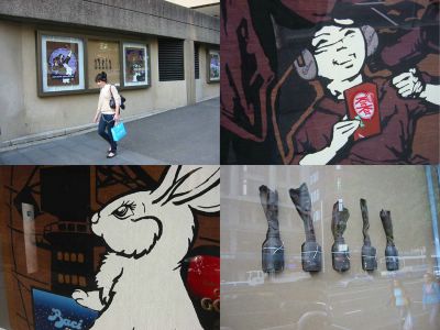
Benedict Ernst, The Chocolate Revolution, installation view.
Pic: Team Art Life.
The Chocolate Revolution is a series of paintings that riff off old Chinese Communist street posters but include trademarks of international chocolate manufactures such as Nestlé, Lindt, Quality Street and others dropped in. Alternating with the paintings are objects made from chocolate that might be used in a revolution – Molotov cocktails, crow bars, bricks. The revolution will be chocotastic! The work – which will be seen in Melbourne at Platform 2 from October 20th – also comes with its own Chocolate Manifesto. In essence the manifesto suggests the world is a confection, a trade off between revolutionary wish fulfillment and consumerist reality while the images and the sculptures are parodic objects meant to illustrate the dilemma of the artist who has seen it all but is not yet 30.
Unfortunately for Ernst, experiencing his work is almost completely unbearable. The actual physical installation is in a brutally unsympathetic location for viewing art, even for work as broad and as flip as this. It may well have a conceptual connection to street posters and fly-posted manifestos of yesteryear, but the only people checking off these points on their art score cards are people like us, not the oblivious passersby on their way to catch a train or tottering past with their shopping. One feels sorry for artists forced into a situation where they have to cling like a pigeon to the vacant spaces of concrete boxes. If this is the pragmatic exploitation of available opportunities, bring on the real revolution.
It could be worse of course, much worse, but when money is on offer you’d be foolish to turn it down. You’d be insane to refuse $10,000 or a ‘round the world airline ticket and $2,000 spending money. This is what you get if you win the ABN Amro 2006 Emerging Artist Award or the ABN Amro Employees Choice Award. For the sixty three artists whose work has been selected as finalists for this year’s comp, they don’t have to be young, they can be in the stable of a major gallery, they can already have their work in the collections of major corporations and they can be in a show currently running at the Art Gallery of NSW and still be an emerging artist. According to the ABNAEAA-ABNAECA an emerging artist is someone whose work sells for less than $10,000 and “whose excellence is evident” which explains how Linda Marrinon is rubbing shoulders with among others David Noonan, Helen Smith, Daniel Templeman and the near-ubiquitous Claire Healy and Sean Cordeiro.
With such a large and unwieldy number of entrants and a foyer space that can only hold a third of the artworks at once, the ABNAEAA-ABNAECA splits up its exhibition into three shows, two in Sydney, the other at the company’s Melbourne offices. Employees wander in and out and decide which art work they like best and then vote for the runner up award. The ten grand goes to the winner of the main award which is judged by an “art committee” and Edmund Capon. Then there is a fourth exhibition of the final finalists and then a big award ceremony. It’s all very complicated and not really aimed at the likes of us. The ABNAEAA-ABNAECAs is for the artists who get a chance to show their work to a “corporate audience” and apparently encourages employees to “deepen their knowledge and enhance their appreciation of art.”
Have you ever wondered where an art work goes to die? Its last resting place is in a corporate collection where it sits in a secondary meeting room behind a white board. We applaud the idea of a major corporation spending its money on generating some cultural capital, but does it have to be done on such a ridiculously convoluted, overly complicated basis? And further, we ask the artists, is this really where you want to see your work – hung on the orange wooden slats of a tastefully decorated foyer in a building designed by Renzo Piano? Yes, of course, we can hear you already – who are we to question corporate good will and, further, how dare we suggest that the works look like shit in a terrible, vacuous, air conditioned hell like the one on the corner of Bent and Philip Streets. Indeed, who are we?
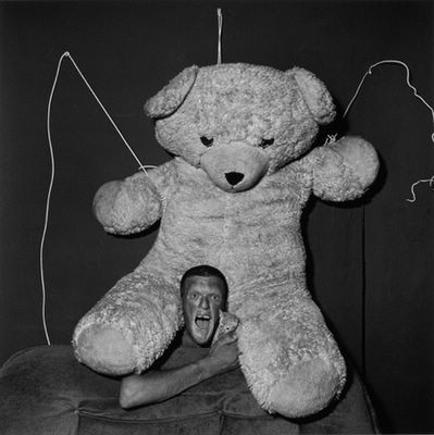
Roger Ballen, Excited man, 2001.
Silver bromide fibre paper print, 80x80cms.
Courtesy the artist and Stills Gallery.
An art gallery is a space that is a specifically designed for looking at art. The four white walls and subdued lighting model has evolved from the crowded salon to the present minimalist model. Say what you will about the advantages of seeing art in a car park or in a foyer or a shopping centre or wherever, an art gallery is a coded environment that advantages the art beyond mere décor. That’s the theory – but every gallery is always a little bit different, arranged to suit the people who run it, ahem, their way. We went into Stills Gallery and it felt like we had wandered into the middle of a blazing row. The room was heavy with a resentful silence as though the staff just couldn’t wait for us to leave so they could get back to throwing plates.
We had come to see the Roger Ballen show Shadow Chamber and soon realised it was the incredible images that had forced conversations to silence. Ballen is an American-born photographer who has been living in Johannesburg for the past 30 years. His earlier work documented life in South Africa and he was pegged as part of a growing resurgence in Magnum-style reportage, but since the late 90s his work had taken on a darker, theatrical bent which, in photographic terms, is like an unholy marriage between Walker Evans and Joel Peter Witkin… with Weegee as the best man. Ballen had been developing this approach with his series Outland [2001], Fact or Fiction [2003] and Shadow Chamber [2005]. Although the Stills show uses the title of his last body of work, the images are a selection from these last three series.
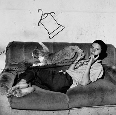
Roger Ballen, Eugene on the phone, 2000.
Silver bromide fibre paper, 40x40cm.
Courtesy the artist and Stills Gallery.
Ballen is a photographer with an individual vision. Although you can trace a number of reference points in art and elsewhere [Beckett comes up a lot in articles about his recent work] what’s really interesting – and unique – is the way the images blur the boundaries between the photographer and the subject. The undeniable theatricality of the work seems to arise from Ballen’s collaboration with the cast of his photographs – big eared toothless men, little boys, animals – performing in what seem to be cells or the unfurnished rooms of squalid digs. Despite the setting, you don’t feel as though the people in the images are not complicit with the artist, either by active participation or by tacit approval. It’s rare to see work like this that doesn’t at some level raise uncomfortable questions about the photographer’s relationship with their subjects – be it, for example, Bill Henson and his naked teens or Polixeni Papapetrou and her daughter – yet somehow Ballen sidesteps all this.
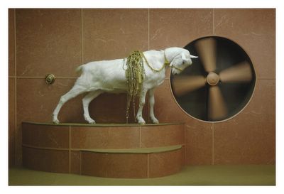
Hayden Fowler, Goat Odyssey III, 2006.
Mounted digital photograph,
65.5×99.5cm.
Courtesy the artist and Gallery Barry Keldoulis.
The other major aspect of Ballen’s images is their classicism. Echoes of Surrealist imagery abound, from the Miro-esque constructions of wire to the Dali like disjunctions of scale to the flinty black and white luster of Man Ray. On the other side of town a young artist is singing from the same song book, albeit in a style much more in keeping with the dance sounds of today. Hayden Fowler’s As Seen On TV mixes his references widely, lassoing together Neo Classicism and Surrealism, a little bit of Matthew Barney and a whole lot of… goat. Yes, goats are the stars of a suite of photographs and 2 DVDs [as well as a young man who finally demonstrates what it looks like to “go suckle on a goats teat” – that well known insult of the far Western Burbs].
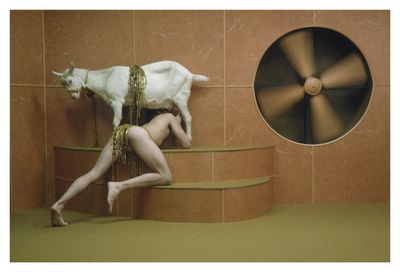
Hayden Fowler, Nursling IV, 2006.
Mounted digital photograph, 79x119cm.
Courtesy the artist and Gallery Barry Keldoulis.
Fowler’s strength isn’t in the uniqueness of his vision but in his sophisticated use of mis en scene which takes the whole enterprise dangerously close to cinema [and hence the Barney reference]. There aren’t many artists working in video who understand that building a sensation is more than a low rumble on the soundtrack and a few costumes for the players. It all has to work together. Fowler’s on to this idea and the rotating fan, gamboling goats and restless wipes give the bits the feeling of eerie cohesiveness. The promo bumbf for As Seen On TV used the phrase “sci fi” which is always a good way to get us interested. GBK shouldn’t have bothered – the work is ambitious and fast moving and although it’s baffling, your ears and eyes are kept moving and wondering. Call it “goat fi”.
