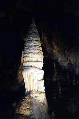
It’s enough to make you so proud – Australia is home to the world’s oldest hole. Scientists using clay-dating technology have determined that the Jenolan Caves in the Blue Mountains are 340 million years old, not the measly 90 to 100 million years as previously thought. Dr. Alan Osborne of the University of Sydney told NineMSN, “340 million years is a very long time. To put it into context, the Blue Mountains began to form 100 million years ago; dinosaurs became extinct 65 million years ago, Tasmania was joined to the mainland as recently as 10,000 years ago and John Howard has been Prime Minister since 1996.”

A hole, 350 million years in the making.
Did you notice something there? We added in that last comment about John Howard. Dr. Osborne never said it. We just made it up and put it in because that’s the kind of people we are here at The Art Life – we’re interventionists. Getting between you and the facts is our artistic medium and it gives us the chance to use the word ‘interstices’ – that lovely little snuggle space where we can get warm between things. Not everyone is qualified to make interventions. You need to be a drug counselor, a member of the military, or an artist, and you need skills to make sure that your intervention isn’t mistaken for being a part of the scenery, or so obvious people ask “what’s that doing there?” Artists love doing interventions into spaces, sometimes they are uninvited [which are the best sort of intervention] but most times it’s an official intervention where they come along and set up their stuff with full approval and support from management. We’ve seen artistic interventions in department store windows, public libraries, memorably at The Australian Museum, and we even saw an intervention in an art gallery. The exhibition Ten[d]ancy at Elizabeth Bay House, the historic house built between 1835 and 1839 and once home to the McLeay family, is just such an official ‘intervention’.

Martin Blum, Sean Cordeiro, Simone Fuchs, Claire Healey,
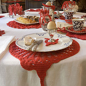
Doily of terror! the devil will find work for idle hands, detail, 2006.
Mixed media, various dimensions.
Courtesy Historic Houses Trust.
We have for many years been huge fans of the parenthetical aside in titles, and we like it even better when you get a mid-word parenthesis such as in the title Ten[d]ancy. It’s what the professionals in the advertising world call a “twofer” – a two for one deal – it’s both “Tenancy” and “Tendancy”. It’s as though the curators of the show Sally Breen and Tania Doropoulos just couldn’t make up their minds until they thought – why not just have both? Certainly they might have hesitated since “Tendancy” is a spelling mistake, but let’s not sweat the details here. On the one side you have the tenants of the house, the historical context of the space, and on the other the artistic tendencies represented by the artists Gary Carsley, Shaun Gladwell, Hannah Furmage, Jonathan Jones, Claire Healy, Sean Cordeiro, Martin Blum and Simone Fuchs, The eight artists have been allowed to come in an mess around with the installation of period furniture and fittings in the historic house inserting their own artistic creations between the apparent historical accuracy and the minds of the hapless visitor who now must interpret what is intervention and what is not. The marooned [d] of the title is emblematic of the sandwiching effect of the various interventions. Just when you think that the whole parenthesis thing is a tired out old wank, it’s completely appropriate.
Inserting your artistic practice into a space such as Elizabeth Bay House is problematic to say the least. The artists in the show run the gamut from subtle and nuanced works that actually play with the space in a knowledgeable and fun way to cack-handed demonstrations of excruciating obviousness. Some are just plonked in there and still look good, while others are plonked in there and look terrible. The most successful works in the show are those by Shaun Gladwell. He’s constructed some very subtle sculptures using various objects, some from the house, others brought in. In one room he’s stuck two gorilla skulls under a glass case, surrounded by various pine cones, on a nearby table some contemporary drawings of Australian birds. In a bedroom upstairs, there’s a table with an array of drug taking paraphernalia – a bong, a bottle, spoon, sugar bowl and glass of water for absinthe. Elsewhere there are more bongs. Gladwell has cleverly brought his own practice to the house – the skulls and the bongs a nice little emblematic insertion of contemporary ‘youth’ culture – while at the same time reminding you that the Victorians were by today’s standards absolute drug fiends. The connections are obvious but subtle too and of all the artist’s work in the show, Gladwell’s works are seamlessly inserted into the theatrical historicism of the space. Healy & Cordeiro were joined by Fuchs and Blum to create Doily of Terror! The devil will find work for idle hands… the title being a play on the time it probably took them to crochet dozens of doilies. All done in red, there are doilies for everything in one room, from the objects on a breakfast table to the chairs and tables to individual chess pieces. You’d think eagle-eyed art reviewers would have taken this in immediately but to perfectly honest, we blanked the entire room. It looked exactly like a bad museum. It wasn’t until we had the installation pointed out to us that we even recognised that an egg cup had a doily on plate that has a doily on a table that has a doily for each of its four legs. It was horror vacui filled with wool.
Gary Carsley’s work has always tended towards the baroque, visually involved with decorative elements coupled with an elaborate conceptual scaffolding. The work has ranged from his early paintings in the 80s through to installation and cut paper pieces and, more recently, settling on a computer-aided visual process that creates landscape images from photographs combined with scanned wood grains. On their own, the images are striking and beautiful, but with the connections Carsley has created between seemingly disparate subjects such as drag, the landscape, colonial history, decoration, and his own subjectivity, the collective experience is baffling. Perhaps this elaboration is part of the baroque urge but in the installation at EBH, an avalanche of fraudulent history arrives through Carsley’s invented historical persona Daguerre [or Draguerre] as well as other simulated real objects dragooned for the occasion – “imitation fake hair” for example. If one is meant to feel the weight of the invention, the work is successful, but we have to admit to feeling like it was like a lot of hard work for not much reward. It has always been our belief that an artist’s work is at its best when it is unadorned. Carsley has demonstrated he can do that with past shows such as his solo outing at Cross Art Projects and we urge him to get back to basics.
Jonathan Jones meanwhile could not be accused of unnecessary decoration. He has placed a series of fluro light tubes across the floor of an EBH bedroom in an installation called Gurrajin [Elizabeth Bay]. We’re assuming that the name is a clue that the pattern, as in other of Jones’s work, makes reference to Aboriginal art of the neighborhood’s original inhabitants. Conceptually it is extremely tight as well as being visually impressive – all those lights lined up in intersecting rows look amazing. We can’t imagine what visitors to EBH would have made of it as, when we arrived, there were no plaques or indications in each of the rooms as to who was responsible for what and the catalogue for the show was MIA, just some laminated printers proofs were supplied at reception for the curious. A giant sign in the entrance way with a description of the project gave little away so far as specific information was concerned. [Some people did get it and weren’t that impressed. “Did not think the art display was good” – Jasmin Curtis, France.] Whatever, Jones’s work looked great. Tucked away in the last room of the house’s two room cellar is an installation by Hannah Furmage called Pig Town. The room has tiny speakers on a wire hung around the wine racks. Voices emerge from the speakers, recordings of people on the street saying things like “I have a dug habit, I admit that, and I take responsibility” in a voice so out of it it’s amazing they were awake at all. Hey rich people, there are poor people out on the street right now! Does your champagne make you feel good? Yes, it probably does.

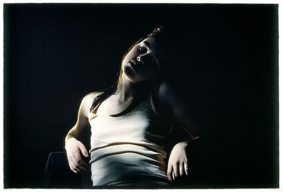
Bill Henson, Untitled #19, 2005/06.
Type C photograph, 127 x 180 cm. Edition of 5.
Courtesy Roslyn Oxley Gallery.
At Roslyn Oxley, Bill Henson’s latest show offers no real surprises. You know what you’re going to get – naked teenagers, sylvan woods, country roads at dusk, cloudscapes. For this show Henson has a done a couple of eerie landscapes with lighting effects we haven’t seen before as well as some shots of ore carriers sitting in the ocean in half darkness, like industrial barks ready to take you off to the land of the dead. But in the context of the body of his work, they are minor detours in what is otherwise a wholly predictable visual language. Henson has the undoubted ability to conjour up a mood with his sequences of dark, untitled images, but it’s a kind of magic that quickly fades. His strength as a narrative photographer is also without question and there aren’t many other photographers who come close to what he does – Gregory Crewdson for frozen moments and looks or Helmut Newton and his use of nudes and classical interiors, but while these artists share some similarity, Henson stands pretty much alone. We have to admit to feeling somewhat resigned to the idea that Henson seems to have learned from bitter experience that his audience isn’t much interested in torn up photographs, or images of carnage on the streets of LA – what they want is naked girls in the dark, perhaps with a chest wet with water, maybe a road in the countryside. It’s what sells and these were the ones at the current show that had the biggest sequence of red dots.
Henson’s photography is talked about in terms of its connection to Romanticism and indeed many of its features can be found in the work. Romanticism by definition rejects the rationality of post Enlightenment civilisation and yearns for the natural alternative of landscape, emotion and beauty. Hegel described Romanticism as being a kind of art where the forms in the work are determined by an idea of its content. In other words, although the images seem to exist within an external world, they are very much the imaginings of the artist. The Romantic artist shows us the way they imagine the world should be, how it might reflect the way we feel about the world rather than the drab way it really is. As you look at these works you can see that although the images are indeed taken from the “real world” they are framed, ordered and selected from a very specific aesthetic view, from Henson’s point of view. Particular images in Henson’s works are things that you might actually see in real life, perhaps just for a fleeting moment, but what state of mind you’d have to be in to see the whole world like this all the time we’re uncertain.

Bill Henson, Untitled #10, 2005/06.
Type C photograph, 127 x 180 cm. Edition of 5.
Courtesy Roslyn Oxley Gallery.
The recurring motifs in Romanticism feature in Henson’s work, albeit it in modernized form and sometimes he has become quite specific in his references such as his Egyptian series of ruined temples set next to images of Melbourne suburbia, and again in this new series of works where he evokes savage teenage glades of tossed away porn mags, bikes and cans of UDL. This is another classic theme of Romanticism, the idea of man [or girl] in a semi savage state lost among the ruins of classicism, itself suggesting the impermanence of existence in time. Before the Gods we are ants. The most telling and troubling aspect of Henson’s work – and indeed its most popular aspect – is in his use of the exotic. Side stepping the potentially demeaning aspects of exotica for the safe haven of white trash suburbia, Henson is allowed to objectify his subjects by avoiding any unpleasant and unsightly political readings that might have been created if he used, for example, non white models. Something within this exotica is extremely disturbing because, while some have thought of his images of models as being manipulative, it far more upsetting that what he is in fact doing is luxuriating in a kind of respectable high class kitsch. We do not deny that Henson’s work looks good, and many, many people agree with that assessment, but we cannot escape the thought that in the future these images might have about the same cultural respectability as those green faced Islander girl paintings with the tits out and a piece of fruit on the shoulder. The only difference to that low brow non Romantic wank mag art is that now we choose to find the exotic within white culture rather than in the other.

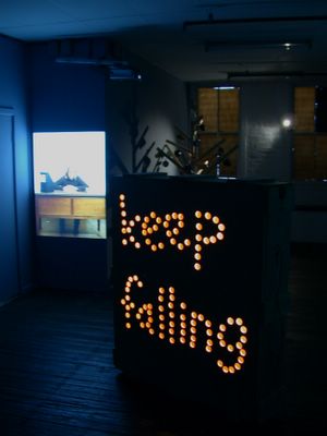
Christopher Hanrahan, Our Still Lives [keep on coming], installation view.
Mixed media, variable dimensions.
Courtesy the artist.
Evoking the Romantic in art is as much an act of faith as it is of cultural archaeology. It would be nice to think that we are individually special creatures with much to offer from the vantage points of our subjective creativity, but the brutalism of psychology exposes the fact were are all one of maybe a dozen personality types. Since art is usually made by people within an even more limited range of personality types looking for difference is incredibly hard. But like great fiction, art rises from an acknowledgement of commonality, not from the misty-eyed wanderings of the artist poet experiencing profundity in the mountains. Christopher Hanrahan’s show Our Still Lives [keep on coming] at MOP Projects fits the bill very nicely. Like his recent work in Rectangular Ghost at Oxley and his solo gig with Esa Jaske Gallery, Hanrahan’s work is a series of figures of speech rendered as sculptural objects. The artist works as one of those guys who sets up shows for other galleries and it was hard to not read the new show as an autobiographical riff on the existential angst of lugging boxes around full of other people’s art. One piece is in fact a big wooden box used for transporting art. Using a hole punch, Hanrahan has drilled the words KEEP FALLING into the side, illuminated from within by a weak light bulb. In another work, Our Still Lives [old grey mashy], the artist spells out the title with his body while singing “the old grey mashy she aint what she used to be”. He does ten times, each repeat getting looser and slower until he’s just flailing around. Mug Tree is a tree built from Ikea wood and has a selection of coffee mugs hanging from it – some for Irish coffee, others with corporate logos, and one with the classic 80s Triple M and angel-guitarist. There is another video of the artist accidentally, but repeatedly, breaking the same coffee cup over and over. Trapped in a loop, the cup rematerializes again with Hanrahan looking glummer and more remorseful every time. If one wanted to look for an image that truly evoked the Romantic notion of man lost in time, then this is it.
