Our project for last week was to visit every artist run gallery in town. We defined ‘artist run’ as galleries not attached to art schools or funded like Artspace or Performance Space, aren’t hire spaces like Blank Space or Blender. What we were looking for were galleries run on good faith and over-extended credit cards, run by a harrassed board and doing a lot with almost nothing. We consulted Art Almanac and when we looked at our list we realised just how few there really are. So we added the hire galleries back in, decided Firstdraft is artist-run because of its regularly changing board of young artists, and then added Esa Jaske Gallery in as well because although it’s actually a commercial gallery we couldn’t find Sydney’s newest artist run space G&A [located somewhere inside a labyrinthine building on Elizabeth Street]. It’s a hit and miss process, we know, but that’s the fun of artist run spaces…
Our first stop was PELT, the gallery in Chippendale that does a huge amount on few resources. With lots of exhibitions and music performances on Sundays, it’s a small if under-lit gem. Vicky Browne’s show Timetable [until April 2nd] is exceptionally good too. Browne uses clapped out audio equipment to make sculptures and installations – old turntables, photo albums, transistor radios, handmade turntables and ceramic iPods. The works sit in three rough categories – ready-mades that the artist uses to create a commentary on the materials and their associations; completely fabricated objects that are facsimiles of other objects [tiny turntables]; and more abstract works that are either literally abstract – weird fur shapes that hiss – or are ambiguous objects in a new context. An installation in Timetable is a trio of turntables that play recordings etched on to the surfaces of copper and aluminum discs and inscribed CDs. Night Music is an aluminum record that plays a crackly recording of owls while the copper disc Morning Music plays kookaburras. The CDs are recordings of the artist singing ‘hits’.
Vicky Browne, Natural Progression, 2006. Mixed media, various dimensions.
Courtesy PELT.
Thirteen was a photo album filled with drawings. On each sleeve there is a magnetic strip that contains a 10 second sound recording activated by pressing a tiny button. This odd little feature was probably intended for users to say something like “This is me on holiday last year” but which Browne has used to record a line from a song. The drawings – scribbly, loose almost doodle-like images of deserted suburban landscapes, houses with open windows, a backyard with some rabbits – is accompanied by a plaintive voice warbling unintelligibly. The childishness of the images, the sorrowful song and the title Thirteen is so heavy with association, it is absolutely enthralling. Using technology that is on the way out – and going right back to the start with her own record etching – Browne has rediscovered the spirit of the recent past when yesterday’s technology seemed a little bit more humane than today’s digital empire. Browne inscribes the personal into the gaps of the commercial.
Around the corner from PELT is the Sydney College of the Arts-related gallery Peloton. Vicki Wilkes has a show there called Encoded, a modest exhibition of 5 canvases. A formalist experiment in arranging lozenge shapes of various colours on single colour backgrounds, the gallery handout explains that “the artist derives pleasure from counting, balance, and simply adding and subtracting colour.” We’re not sure if the viewer gets the same amount of pleasure from the paintings as the artist does but if you like multi-coloured lozenge shapes, this is a show for you. Recently we realised that while we are interested in the formal qualities of art – the sorts of aesthetic choices made by artists – we’re not particularly interested in formalism. Like the work of John Nixon, for example, we get the idea and respect the project, but on the other hand, it does nothing for us.
Sarah Mosca, Lovers 2002, 2006.
C type photographs, two panels, 90x75cms each. Courtesy Esa Jaske Gallery
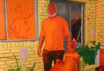
When you walk into Esa Jaske Gallery, Mr. Jaske usually has some nice ambient music playing in the background, which is as it should be seeing as how he’s from Finland. Pretty much everything we know about that part of the world comes from Aki Kaurismaki movies and ambient blip hop and Sarah Mosca’s show Lovers [until April 15] is in much the same style. Mosca’s show is a series of life-size head and shoulder shots of couples, arranged in pairs around three walls. The titles clue you into how long the people in the images have been together Lovers 2003, Lovers 1973 etc. On the facing wall are large images of a bed with careful arrangements of pillows. There are a number of reactions to this arrangement – the most obvious is that there is one less bed than there are couples, which might suggest a race to claim a spot, or perhaps these people are not all still couples? We would have thought they are, since Mosca’s show also seems to prove the adage that people in long term relationships look alike.

Isobel Johnston, House with picket fence, 2006.
Fabric paint on wool tapestry, 26 x 38 cm. Courtesy Esa Jaske Gallery.
In EJG’s front room is a show called Nothing Really Matters by Isobel Johnston and Jude Crawford. Johnston has a series of found fabric tapestries which she has treated by darkening their surfaces with dye, leaving circles of un-dyed fabric shining out. Crawford’s works are large cut paper stencils of swirling shapes that reminiscent of plant forms. The title is an absolute winner – nothing [absence] really [does] matter[s]. It’s all in what’s left out. We must admit to an instant attraction to Johnston’s work as it fits so nicely into our emerging mega-theory of everything that’s going on in the art world [in general], but to be perfectly honest, some pieces work better than others. One work – a large two panel screen almost overwhelms the rest of the show, but you get the general idea. We thought for awhile that Crawford’s work was actually by Jacqueline Belcher, the artist whose cut paper works we admired in Slowly, Slowly at Kudos in February, but we were mistaken. It seems there’s a seething underworld of artists quietly getting RSI from all the scissor work.
One of the great opportunities for artist run spaces is for younger artists to get their work seen alongside work by older and better known artists. It’s part of the “leg up” theory that ARI’s can help an artist find a larger audience for their work, to get the crucial word of mouth happening that might just land them a spot in a curated museum show or entry into a commercial gallery. ARIs can also offer space to established artists to do projects that might not suit their commercial gallery careers or who are for those sick of waiting 18 months for the next spot – and then it’s all money making paying the mortgage and fuck the risky shit.
At MOP Projects until April 2 Gianni Wise has his work Who’s (looking at) who? sitting next to an installation by Adam Cullen and Cash Brown and it’s an interesting mix. Wise’s work is an elaborate installation that riffs on the form of the photo booth. You enter the gallery space through a heavy curtain and facing you is big black TARDIS-like box with a tiny screen recessed into the surface. The screen plays video footage of people on the street. The footage is crapped out greenish video and there are ominous sounds coming from a speaker behind the scenes. Around the walls are strips of images like photo booth prints, except they are taken from TV – Margaret Thatcher, David Lynch and a bald guy who might be Martin Heidegger or Pik Botha. There is a quote from John McDonald on the gallery handout – “Politics is an embarrassment in much contemporary art – an exercise in selling prepackaged opinions to the converted”. Aside from the pot-calling-kettle-black absurdity of that statement, the key here is the ‘prepackaged’ concept. Wise’s installation is both demonstrative and yet oddly ambiguous. He says his work is a “private space of instant gratification and voyeurism where we may begin to ask who [is looking at] who? in a world of otherness” but it does not offer voyeuristic pleasure – the gaze is directed by the artist, edited by the artist, authored by the artist. The form may derive from a photo-booth, but the audience has no control here, we can only to act as receptors. Is that the point?
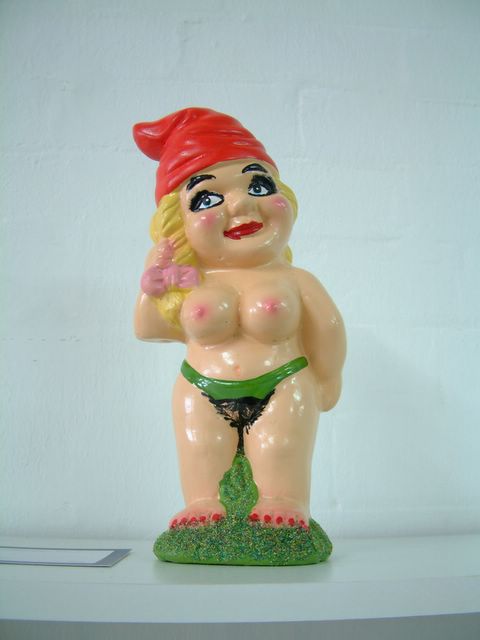
Adam Cullen and Cash Brown, Garden Slut, 2006.
Limited ed.
Courtesy of the artists.
Next to Cullen and Brown’s installation, Wise’s work seems more ambiguous than it probably really is. That’s because Cash and Brown’s show Wholesale Therapy is so blunt it’s like being hitting over the head with a 4×2. The show, an installation that takes up the big gallery space, offers brutally effective gag products, somewhere between a joke shop and an art tourist trap. Some of the objects relate to the art world – the Funding Body Hard Ball for example – whereas others come straight from the menagerie of monstrosities that populate Cullen’s paintings – the Garden Slut for example would look right at home in a big acidic canvas. Other products are just as furious – Skanky Ho Barbie [with condom, syringe, bad make up], a soft home for pigs and a Satanic Doll Kit which is presumably meant for sticking pins in, or letting loose Chucky style. There are some other eye-watering products, a hair candle for instance, and some surprises; it’s not a well known fact but Cullen is a dab hand with pot pouri and jams, but there’s a “smell bag” on offer. Brown, an artist who is not as well known as Cullen, seems to have brought a lot of pathos to the work – her tiny livestock dioramas are heart rending little scenarios of calves taken from their mothers, cows run over by tractors, and lots of other blood-soaked situations. We wondered if this exhibition by Cullen and Brown was a “good thing”. Did we need to see this work? Was the idea of it enough? One piece, some ready made road-side crosses with fake flowers attached, made us feel decidedly uncomfortable, yet the easy garden gnomes were pretty darn funny. We decided, eventually, that we liked the show because it was so effectively rude, so hard edged, so cruel. There has to be value in that.
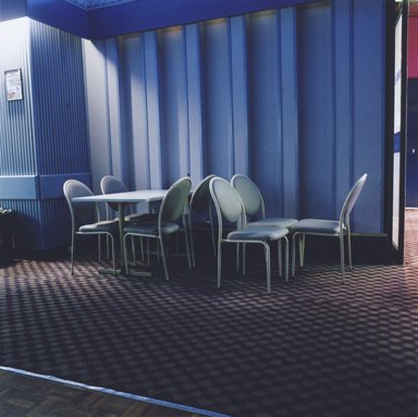
Benison Kilby, Bankstown RSL No.2, 2005.
C type photograph, 90x90cms. Courtesy of the artist.
When we posted the press release for Benison Kilby’s RSLs show at First Draft [until April 1] a reader speculated on the need for the accompanying text arguing that Kilby’s work speaks for itself. We have to agree. Kilby’s work is magnificently plain interiors of RSL clubs she photographed on what must have been a very grand tour and the large scale images capture the incredible spaces that are so peculiar to club interiors, with their arctic wastes of air conditioned carpeting, lonely islands of disused desks and tables, the clusters of chairs awaiting a bingo night. When art is at its best, there really is no need for accompanying text. These images put you in the space, capturing the ineffable oddness of the ordinary.

Bethnay J Fellows, Lone Hissing Leopard, 2006. AO Photocopy.
Courtesy of the artist.
We have been told by Firstdraft management that the artist Bethnay J Fellows was very specific that we include the ‘J’ in her name in any review. It makes a certain kind of sense that the artist should be so specific because her suite of 8 large-scale, photocopied drawings are also very detailed in their information. The show, called Beasts of Prey and other Deadly Creatures, presents the viewer with some very attractive images of animals including the Tusked Narwhal, the Polar Bear, the Wolf and a Black Bear. Each drawing also contains some text – the narwhal uses its tusks for fighting, fore example, and the surprising note that Polar Bears can detect magnetic fields. It is not often that we can say that an exhibition – aside from being visually attractive – is also educational and informative. We can say that about Beasts of Prey. We can also say that we enjoyed it in a way that we have enjoyed few shows lately, leaving Firstdraft in an upbeat mood, and considering the artist’s declaration that “I can draw your pets or portraits.” We might get Bethnay J Fellows to do the official Art Life portrait.

Sandra Scheffknecht, Doubledeath 05A, 2006.
C type photograph, 90x90cms. Courtesy of the artist.
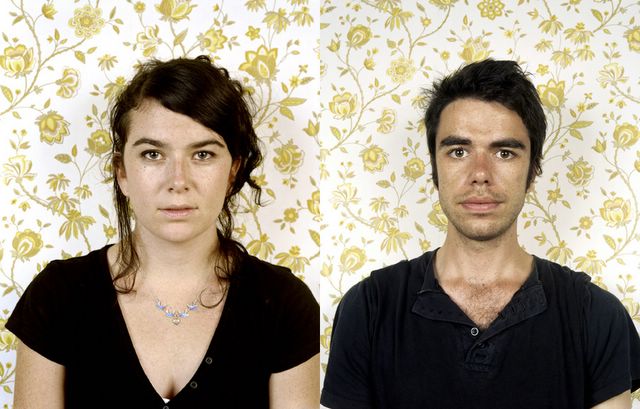
Our second last port of call was to Blank_Space on Crown Street in Surry Hills. With the COFA student space Kudos Gallery looking like it’ll close down without financial assistance, Blank_Space is there to lease out its premises to all the students who need to have shows as part of their course assessment. We were very lucky to discover that the show by Sandra Scheffknecht, an MA student at COFA, was very good. Blank_Space is so hit and miss you have no idea what you are going to see and the shows are on for such a short period they are very easy to miss. Scheffknecht’s exhibition, Doubledeaths 2005-2006, was on for just six days and closed yesterday. Trading in an aesthetic not dissimilar to Mosca’s show at EJG, Scheffknecht had recent works hung next to older material, large scale images using that we took to be twins but turned out to be artfully placed prints of the one model. The idea was that the works were meant to question the reality of the photographic image, a well worn theme in much recent contemporary art. Where Scheffknecht’s older works were a little too obvious, her recent material taken on a trip back home to Austria show enormous promise. There’s something eerily Blade Runner-esque about this stuffed deer with the tiny serial number on its hoof – but then, as we said, we’re suckers for pathos.
Klaus Major, Sensorium, 2005.
Type c photograph, 10.2x10cms. Ed of 5.
Courtesy of Blender Gallery.
We finished up our mini-tour at Blender Gallery in Paddington for Klaus Major’s show Sensorium, a collection of his pin hole camera work. We like the idea of using a pin-hole camera in the same way we like Vicky Browne’s use of old audio technology. It suggests a back-to-basics approach that is magical and evocative and all the more amazing because it reveals the physics behind the process. But there is a million miles between Major and Browne – where Browne lets the material do its thing and presents it very casually, Major’s work seems restricted and pent up, like they need to be bigger, freer and not constrained by consumer friendly framing. Someone once asked us why we don’t like it when artists sign their names on their paintings and we couldn’t articulate why. We can now say that signing your photograph really detracts from the image and we just want to marvel at the fuzzy world of light captured on the paper, not to notice that the artist has a tiny cramped hand or that it is an edition of 5.