Ladies and gentlemen, please put your hands together for the second in our series of guest blogs, this week courtesy of The Artswipe. Known affectionately as “The Swipe”, this energetic, gender non-specific blogger has been rocking since June 2006. Please to enjoy…
Is video art only interesting these days if it’s installed with multiple screens? For some time I’ve been deeply suspicious that video artists use more screens to distract you from the crappy content. In search of the truth, I watched Mythbusters a few times hoping they’d road-test my myth. But it became clear after a few episodes that they were too busy seeing whether mobile phone usage at Caltex stations causes spontaneous human combustion. Realising, however paradoxical, that TV can never answer perennial questions about video art, I thought I’d set out on a mythbusting journey across Sydney’s current video shows.
En route I passed a shop window display featuring heaps of TVs showing sexy MTV-like fashion models glamour-fitting down a catwalk. Resisting the temptation to review the window display as some Art Express homage to Nam June Paik, I soldiered on to the Art Gallery of NSW, in search of this thing we call ‘video’ art, however packaged by the digital vibe of DVD technology or computer media applications like Quicktime. Boy do I miss the good old days when the artkids used VHS, or Super VHS if they were, like, being really top shelf. The days before we suffered in silence as viewers coming to grips with the new media ‘c word’: convergence.
Surely Anna Munster and Michele Barker, currently exhibiting at the AGNSW, know a lot about convergence. In addition to being artists, Munster and Barker are new media experts and lecturers at the College of Fine Arts. Last year Munster published a book called Materializing New Media: Embodiment and Information Aesthetics. I’d love to have it in my bookcase for some good old fashioned cultural capital, but what’s the point when it’ll sit there alongside every unread Marshall McLuhan book I’m proud to announce I own.
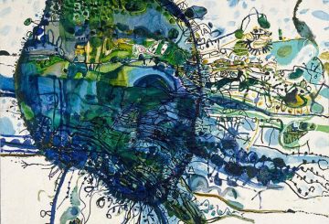
Munster and Barker’s Struck (2005), a three channel DVD installation, examines the disorienting experience of being diagnosed with a neurological disease. Accompanied by a soundscape of eerie instrumentation underscored by muffled cries, heartbeats and breathing, we see a naked woman, out of focus and captured in grainy black and white tones. She steps into the light – or a lit bit of flooring. It’s all very moody. Three screens document the experience, incorporating medical and scientific imaging techniques. Overlaid are fragments of text describing the woman’s experience, but from a seemingly institutional gaze, vacuum-sealing her subjectivity. It’s all very phenomenological.
So far, I’m not sure if the three screen endeavour makes it any more interesting. Actually, it felt like I could be watching an impenetrable short film on Eat Carpet – the now defunct SBS program showcasing arty shorts. And only one screen is needed to watch that. But new media types love their ‘immersion.’ Apparently the way to achieve immersion is with big screens, more than one, and preferably a checklist of media on the converge … of my nervous breakdown. Struck, therefore, makes the grade if we follow that criteria. But, did it “draw the audience into the turbulence and confusion of the emotional experience of disease” as the AGNSW press release claimed? I was about to experience a twitch of “turbulence” when the AGNSW loudspeaker announced a guided tour around the Archibald exhibition was about to commence. Sadly, my own cognition, subjectivity, phenomenological and perceptual processes – to use some of my fave Scrabble words this week – were just dulled to the point of boredom. This ménage-à-trois of screens simply didn’t do the trick this time. My next episode of mythbusters will revolve around this question: Is it possible to be a new media artist and lack seriousness?

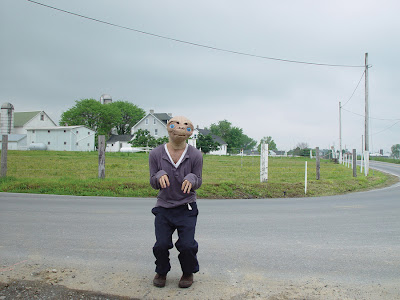
© Olaf Breuning production still from Home 2003.
Courtesy Australian Centre for Photography.
Mixed media artists are rarely serious. How can they be when they’re so damn promiscuous with their media? Entering Olaf Breuning‘s mixed media circus at the Australian Centre for Photography was just the tonic needed to rouse my narcoleptic stupor. Go the ACP! They really know how to entertain. That pet show they did was so fucking cute. They put the ‘pop’ back in popular, they put the ‘go’ back in the Go-Gos. And really, their exhibition of work by Swiss artist Olaf Breuning is as good as any of the Belinda Carlisle incarnations (the “so Frenchy, so chic” comeback included). All tacky z-grade gimcrack, with shiny C-type resolution, Breuning’s photos stylise the freakish through fairly demented references to trashy pop cultures. But before you get to them, one must enter the gallery space, only to be confronted by a motionless party of spooky ghosts. You know, white sheets draped on probably hat stands. Basically like a David Griggs painting if you were wearing 3D glasses. Better call the Ghostbusters – a mythbuster may not make it out alive. Sandwiched between the ghost install and the C-types glossies is a two-screen video installation called Home. So, I ask myself at this point: are two screens better than three (with or without the 3D glasses)?
Shot in black and white, the right hand screen of Home features a guy spinning a few aimless yarns, while the screen on the left illustrates the narration in digital video colour. In one tale, a stranded desert island couple spear fish and grow Z.Z. Top beards. In another, a guy vomits the words “I Exist” on a snowy mountain top. Then there’s a gang of thugs who assault an Amish guy by stripping him bare and placing an E.T. mask on his head. In an inspired turn, a group of teenage girls pop pills and are molested seconds later by the same ghosts installed at the ACP. Two screen action is by far winning the competition so far. Maybe Breuning’s work is doing it for me, simply because it’s so entertaining. Is that so wrong? Art that entertains is my idea of March multitasking. Like his characters, it appears Breuning has been taking some serious drugs. Maybe he wouldn’t mind spiking a few drinks at new media exhibition openings?

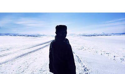
Issac Julien, True North Series, Ice Project Work No. 7. 2007.
Courtesy Roslyn Oxley Gallery.
But wait, over at Roslyn Oxley9 Gallery is a single screen video work called True North (2004) by British artist Isaac Julien. Only one screen, surely it can’t be? What a day: I’ve had a screen threesome at the AGNSW, some missionary two-step at the ACP, and now a solo session at RO9 – how handy!
Settling back in a gallery for the number nine inclined, counting backwards three to one, while rarely checking my watch for the time, I really started to wish I’d brought a calculator – numbers have never been my forte. The room notes by Shaheen Merali say True North is “loosely inspired by black American explorer, Matthew Henson (1866-1955) who accompanied Robert Peary and was one of the first people to reach the North Pole, later writing an account of his experience.” The background info does little to explain the “loose inspiration” and it doesn’t really matter. Set in a natural glacial sublime, a black woman treks through the ice and very little happens. A crisp soundscape punctuated by the occasional poetic voiceover adds to the drama, making the 14 minute duration an experience to behold. “Death comes from all directions at once,” utters the disembodied voice and electrical currents shoot through my spine as I contemplate its meaning. The combination of image and sound is just so arresting, its visual power heightened through suggestion rather than statement.
Glancing at the room notes again momentarily, the spell of suggestion is ruptured: “The installation contests binaries which are present in many notations of the expedition and of adventure that clutter the history of discovery – here reason, order and stability are replaced by irrational meanderings, symbolic gestures from shamanistic tropes and the constant seeping inertia of the ice.” Not sure I saw that on screen, but if you say so. What I did see – to get back to my mythbusting escapade – took place on a single screen and it worked. Less is definitely more. But in addition to being an artist, Issac Julien is a noted filmmaker who has made avant-garde shorts, feature films and documentaries. True North was shot on 16mm film, so maybe it’s not really a video work after all. Semantics aside, the filmic quality is exactly why True North is a breath of fresh Arctic air: it expertly channels the old fashioned immersion of cinema over the gimmicky lure of multi-channel distractions.

