Marcus Trimble, editor of top architecture blog Gravestmor completes his three part guest blog for The Art Life with this installment on new art galleries around the world. Please join us in thanking Mr. Trimble for his fine efforts and please enjoy…
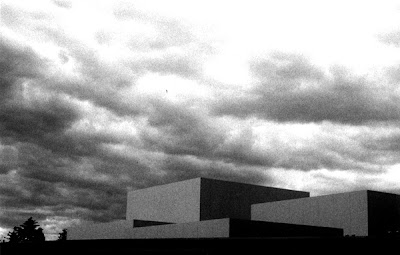
Sitting on the Austrian edge of Lake Bodensee, this gallery is a perfectly crafted little glass and concrete box by swiss uber dude, Peter Zumthor.
The exterior is clad in overlapping glass shingles sitting in stainless steel clips, giving the building an ephemeral, transparent quality. This forms a loosefit screen that allows daylight and into the gallery spaces within. This being a Swiss building built by Austrians, not one bit of glass or steel or anything is out of place. At night the building glows.
Within the glass facade are a series of concrete boxes forming the gallery spaces. Each floor is separated from the one below and above to allowing daylight to penetrate into the gallery spaces. The daylight is diffused through the space by a suspended glass ceiling. The galleries themselves are massive rooms without columns, the walls left in their raw concrete, providing a neutral backdrop – not unlike photoshop grey – to the art. Seen here during a Cindy Sherman show:
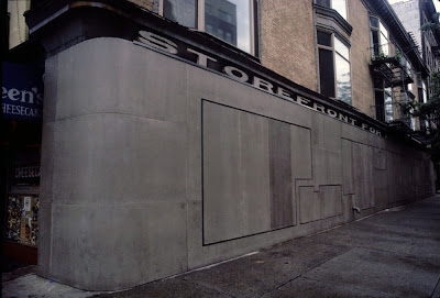
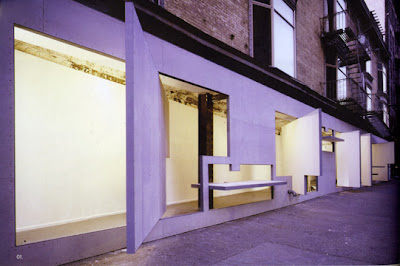
You art people may know Vito Acconci as that guy that used to masturbate under the ramp in the gallery, but here, in collaboration with architect Steven Holl he was responsible for creating a most interesting gallery space. The gallery is situated in the undercroft of a building, and is a wedge of space that is about 4m wide at its widest and narrows down to half a metre at its end.
Acconci and Holl, put up a long fibro-clad wall to the street enclosing the space. This wall has a series of variously shaped cutouts that spin along their horizontal and vertical axis. In the closed position, they form a wall to the street, and completely enclose the gallery space, and in the open position they open out onto the street, effectively doubling the gallery space by inhabiting the street.

The effect is rather nice.

Incidentally, May 29th sees the beginning of a week long event, Postopolis, will be taking place at the Storefront where a bunch of architecture bloggers get crazy in the rotating planes.
This is the awesome. Bearing in mind that it is a pretty fluid list; this is probably on my top five buildings of all time list. The literature tells us that it is a gallery devoted to art of the 21st Century, however when we visited, there was a retrospective of Gerhard Richters work so go figure.

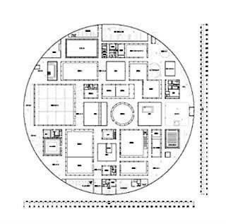
The Kanazawa Museum sits in a park over the road from the Kenrokuen gardens – noted as being one of Japans Top 3 Gardens. It is a large cylinder with a bunch of blocks thrown in and a couple of courtyards punched out for good measure. Like much of SANAA’s work, this building is a built diagram. The boxes are the gallery spaces, the glass cylinder that surrounds them forms the circulation space.

As each of the boxes is a separate entity, the curators of the shows may devise how the galleries are filled and how people move between them according to each show, thereby making each visit to the gallery a new experience.
Like, the Kunsthaus in Bregenz and unlike the Storefront, this is a meticulously crafted building. In order to maintain the clarity of the diagram, of the idea, it has to be. The slightly curved glass and ultrafine steel structure give the building the sense of being a model, something made of paper.
