Since Artspace hung out the UNDER NEW MANAGEMENT banner earlier this year, we have been keen to see the changes brought by the arrival from the Performance Space of newish executive director Blair French. The cosmetic changes have made the gallery seem lighter, happier. People can be seen walking around talking, smiling, greeting visitors as they come and go. The bookshelves groan with newly published readers, the Apple Macs gleam, and the artists names are painted on the walls of the galleries in tasteful grey on white. The new cool and happy demeanor of French Style extends to the shows.
Philip Brophy’s Evaporated Music 2: In The Mouth of Metal at Artspace is plush. The DVD is shown on a widescreen TV, the sound is pumped into the gallery space via a high end 5.1 surround sound system and there’s a comfy leather couch to sit on, a tasteful rug for your feet and subdued mood lighting to soothe the eyes. It’s like being in an AV lounge of the kind you find in those specialist audiophile shops that screen videos of aquariums accompanied by Japanese jazz played on incredible, handmade speakers. The visuals of Brophy’s short, looped work are perfectly suited to this kind of presentation. Pirating a scene from of a long forgotten TV show called California Dreams – and complete with network watermark – the sequence is of a band playing in an implausibly art directed studio setting. Racially diverse in a way that never actually happens in real life, the band croons their way through a song for an appreciative audience. It might be Christian TV, maybe some terrible soap, but whatever it is it’s simply horrible. Brophy’s intervention into this readymade visual is to strip out the original soundtrack and insert his own music. He’s made a Death Metal song and, in an impressive piece of technical wizardry, the artist has perfectly lip synched the new lyrics of his superbly produced dirge to the existing mouth movements of the on-screen actors. The disjunction in generic styles is quite startling.

Philip Brophy, Evaporated Music 2: In The Mouth of Metal, DVD still, 2006.
Since his days with Tsk Tsk Tsk in the 80s, Brophy has been remarkably consistent in the things that fascinate him. Be it horror cinema, the soundtrack work of auteur composers, the art of Japanese manga authors, the obscure worlds of micro musical genres, all of it has been consistent with the taste of an ?ber-nerd, the sort of bloke with enough money and time to indulge his teenage fascinations well past the point of mere obsession and out into the fetid realms of the masturbatory otaku. Judging by his art, you imagine Brophy is the kind of guy who reads all the liner notes on CD covers, stays right to the end of the film to read the technical effects credits and bores people at parties by reciting his personal top ten of Sci-fi soundtracks [complete with a citation of year of release, studio, availability on CD, vinyl and maybe even 8 track Cartridge]. In short, Brophy would be the art world equivalent of Quentin Tarantino if it weren’t for the fact he was around for years before anyone heard of Tarantino but his movie Salt Saliva Sperm Sweat never did the business that Reservoir Dogs did, and anyway, he’s a writer, composer, film director, teacher, lecturer and curator/developer.
Brophy probably doesn’t have any problem with the fact that his work lacks authenticity. He cherry picks bits and pieces of pop culture artfully arranges his found elements into quite stunning facsimiles of other people’s work, yet Brophy’s art lacks the blood, fire and vigor of the stuff made by people who’s only concerns are keeping it real and expressing yourself. Death Metal is a dead musical genre, as dead as California Dreams, and in the hands of Brophy it doesn’t take on any new life. W suspect that Brophy’s games are about bigger things than just hijacking youth culture of the recent past for high art pastiches. The problem is that the project is both muddled and all too obvious. It’s hard to believe that anyone can be bothered with mix ‘n’ match appropriation these days let alone be willing to commit the energy to even consider what it might mean. If in doubt, look it up in your Routledge reader fa christ’s sake! We have always appreciated the superficial stylishness of Brophy’s work, but it’s quite a surprise to discover that apart from the occasional shift from one medium or another, conceptually nothing has changed since 1985.
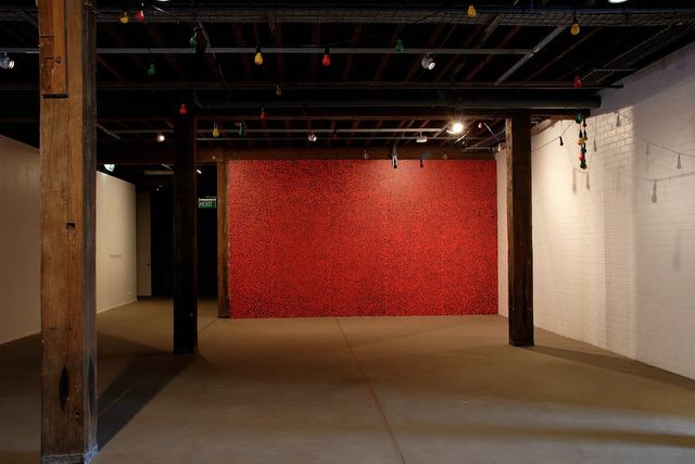
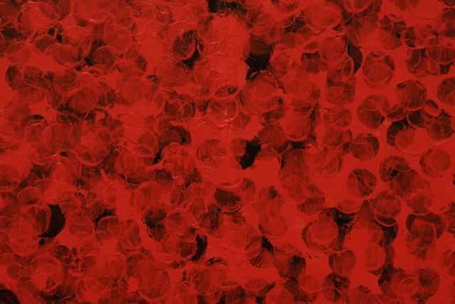
We’re not quite sure how long we have been following Maria Cruz’s work, but it’s been awhile. We had come to accept her appropriation of the career of Yoko Ono, making paintings of all the titles of Ono songs, and then there was a series of paintings she exhibited with Kaliman that had nice decorative bits with text. She is an artist that one must accept does not make ‘pieces’ [to paraphrase Ed Ruscha] but is someone who slowly, over time, explores an idea in incremental steps, little nuanced projects that look bland in isolation but which might add up to something over the long haul. Our problem with this is that we just don’t have the time. Her installation at Artspace is called One Million Dollars in which the artist has attempted to make an impression of a one dollar coin a million times to apparently see what that would look like. Hanging in front of the wall with all the dollar impressions is a string of coloured lights. Only they are not lights, they are facsimiles of lights perhaps made with papier-mâché. With maybe only another 30 or 40 years left to us, we decided to not try to interpret this work and turn to the room notes:
Wealth and currency form the driving imperatives of our society. They may even crystallize our sense of struggle in relation to life and death. One Million Dollars emerges from Maria Cruz’s considerations of the social values placed upon money, from hard cash to intangible digital data. As Cruz states, generally speaking, it is hard not to like money. And so this project evolved with the goal of gathering and seeing the impressions one million Australian dollars on a flat surface, in colour. Knowing that what is presented is a recreated and devalued version of One Million Dollars creates an interesting tension with the cultural drive to honour, even worship, and ‘value-add’ to money as social force.
We agree, it is hard not to like money, especially when you don’t have much of it, and a lot of money in one place would look quite festive. In the case of Cruz’s Artspace install, one million dollars looks a lot like the pattern you used to find in waiting rooms on suburban train stations. Do they call that “scumbling”? But what of the not-lights, the fake string of party lights hanging from the ceiling? Look, we just don’t have the time and we can say with certainty that Cruz’s work “crystallizes our sense of struggle in relation to life and death.” We are all going to die soon so if you have something to say – out with it!
Courtesy TORCH Gallery Amsterdam and Sabine Schmidt Galerie Cologne.
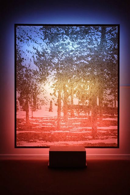
Gary Carsely’s Looking at works of art in the light of other works of art is a punning and verbally dexterous installation of the latest iteration his draguerreotypes. We made comment here of his recent work at Elizabeth Bay House and its over egged presentation making the assumption that a single message was the ideal goal. How wrong can you be? Carsley seems content with making things as complex as possible, layering his ideas in the same way he creates his images from layers and, in an accompanying text, going the route of Saul Bellow by changing tack mid sentence to throw in a new idea. Carsely is also fond of mixing his technology with his cultures and in this show he has created a little platform on which one can perform a shadow dance. The artist encourages visitors to record themselves with their mobile phones and send the results to him at a Youtube address. Maybe, like Cruz’s work, you need to see Carsley’s work over time to really grok what’s going on, but we have decided to surrender to the delirious complexity and enjoy the ride.

Kensuke Todo is a Japanese artist resident in Sydney and he writes in his catalogue notes for his show at King Street Galleries that his latest body of work is partly a way to deal with his sense of dislocation living in Australia. Like a number of other contemporary artists Todo makes small scale sculptures that quote architectural details in semi abstract sculptures. You’d be forgiven for thinking as you walk through the door of KSG that you may have stumbled into a show of lost Clement Meadmore works, all of it done in sleek soft metals, burnished like bronze, but in fact these are very detailed and miniature worlds awaiting your inspection. The works run from literal renderings of buildings to pieces that look a lot like 60s Minimalist sculptures that, not coincidentally, live in the forecourts of equally minimalist 60s buildings. The sense of completion in Todo’s sculptures is an interesting feature, but one is left to wonder where these details are taken from. Sydney is certainly not a city that has preserved much of this kind of architecture, but we imagine that instead of the literal illustration of the details that trouble Todo, these works are actually metaphorical environments through which the artist and viewer’s imagination may wander..

Time Being is the name of Marisa Purcell’s show at United Galleries, a brand new gallery at 179 Palmer Street in East Sydney. [We don’t know if United Galleries have anything to do with United Cellars, the company that uses the flip side of Purcell’s room sheet to advertise Chardonnay, Riesling and Cab Sav, but when we visited the gallery itself we couldn’t get close to some of the work because of all the boxes of booze around the place. The gallery is long, thin, has loads of natural light and is so violently air conditioned it’s like a deep freeze in there]. The last show of Purcell’s we saw was at Kudos Gallery where she was testing out some of her ideas in intimate scale. Her combinations of figuration and abstraction with images of nature and more obscure items were a compelling suggestion that she may have a lot more to discover on her journey. For Time Being she is painting big – up to 182×267 centimeters – and has become more painterly, letting her oil paint wash and drip while letting some of the more definite figuration drift in favour of a dreamy abstraction. We were attracted the works that let the large areas of background colour breathe and the smaller works which had a more definitive, deliberate feel, but there’s something in the unresolved manner in which the larger works hang together that suggest Purcell is an artist still exploring the range of what she’s doing, and that’s always exciting.
