There must be a point at which you decide it just doesn’t matter anymore. Throw the rule book out, do what you feel and don’t worry about the consequences. This kind of liberation is usually reserved for people who have lost their marbles and don’t mind singing opera at the top of their lungs in the middle of a busy city street or, indeed, for those who no longer have a need for pants. For artists with a significant body of work behind them, liberation from the weight of their own expectation must look like the Promised Land. No longer must they follow the rules and decrees of what is responsible, no longer to be strictured by the unbending governance of their big concept – they just want to break free!
And so we come to the strange case of John Hoyland, a senior British artist spending a gentle winter in Sydney that’s more suited to a man in his 70s. Hoyland has a show with Michael Carr Art Dealer in his swanky Woollahra gallery and the new work is the rudest, freest and craziest show we have seen in years. Hoyland in the 1960s was one of the leading lights of Hard Edged abstraction and many of his very fine colour field style stain paintings ended up in the collections of various museums. From the early 70s, Hoyland started getting funky with texture and now, some 30 odd years later, his latest body of work is a texture extravaganza, the faint echo of those early famous works sounding in the artist’s mind like a futile call for all boats to please return to the hire shed. The works in the Michael Carr show seem to show little regard for conventional colour and compositional niceties, mixing garish colours, vivid greens and reds with splatters and pours over painted burnt reds and royal purple. Considering the paintings a little longer, one begins to realise there is an astute painter’s logic at work, the seemingly random elements marshaled together by the assured hand of someone who’s being doing this stuff for decades.
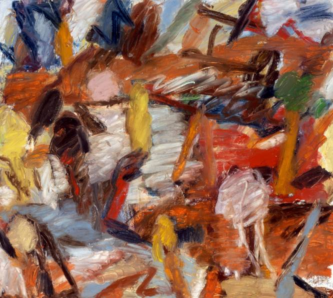
 John Hoyland, Souvenir, 2006.
Acrylic on cotton duck, 172x152cms. Courtesy Michael Carr Art Dealer.
Michael Carr must have thought that Hoyland needed some quality back up for a show by someone who, although having taught at Melbourne Uni in the 79 and been in shows around the world, isn’t all that well known in Australia. Carr of course turned to The Esteemed Critic for a catalogue essay. Faced with the sheer madness of this show, McDonald was forced to retreat to Hoyland’s impressive CV stating that [the exhibition is] “the work of an artist whose fifty year career now reads as a rehearsal for these paintings. For even if one prefers the works of previous decades, there is no denying that Hoyland is painting with greater freedom than ever before…” But is there such a thing as too much freedom? Hoyland works in two canvas sizes – large and huge. The smaller works betray their architecture and are pent up monsters. The larger ones – such as Souvenir – have more room to breathe and in their freeform bravura step grandly toward the universal aesthetic of Bad Painting, and freedom, horrible freedom.
 Ross Laurie, Untitled, 2006.
Oil stick on archers paper, 81x87cms.
Courtesy Damien Minton Gallery.
Damien Minton Gallery in Redfern is a quality space showing quality art. A former employee of Ray Hughes, there’s something of the old boy’s appreciation for meat and potatoes painting at Minton’s own gallery. Sometimes you want to get back to the basics of art – painting and drawing – yet you’re not necessarily enamored of Darwin stubbies at 11am, you’re more a croissant and coffee chap. And there’s nothing wrong with that and Damien Minton Gallery is the place for you. Pia Larsen’s Pink Noise and Ross Laurie’s Paintings and Drawings 2006 at DMG are fine examples of shows by artists without a lot of fancy schmancy grandstanding. Larsen has a forest of free standing sculptures called Bullrushes, abstract figurative shapes that balance on the top of wires and sway in the breeze of a discreetly placed fan. Made from steel and etched with lines and marks, the work is meditative and calming. Her accompanying wall works – Sound Waves – are hand cut aluminium abstract shapes hovering over printed backgrounds. Verging on the fidgety and migraine inducing in their deployment of self conscious design elements, they are still charming distractions. Laurie’s work is reminiscent of Idris Murphy and indeed, Murphy has provided a few words for the catalogue. The work navigates a course between abstraction and figuration and are at their best when they dispense with all the gesture, freeing up their space for a few artfully composed blocks of colour and lines. Perusing the catalogue we find The Esteemed Critic has been here before us again, a paragraph lifted from a very positive review of Laurie’s work from June 2005. It certainly lets you know where you are.
 Mark Seliger, Cindy Sherman.
Courtesy Sandra Byron Gallery.
It pays an artist not to be too clever. Obviousness never really hurt anyone, so long as it is mixed with a little pinch of ambiguity or layered with technical bravura. At Sandra Byron Gallery, the work of celebrity photographer Mark Seliger demonstrates how a bloke who does covers for Vanity Fair and GQ spends his free time – he does the same thing, only at home. In My Stairwell is a collection of portraits of Seliger’s famous mates posing in front of a brick wall in his stairwell [hence the descriptive title]. There’s Cindy Sherman, Mathew Barney and Jeff Koons, there’s David Bowie, Mick ‘n’ Keef, Burning Spear and Ben Harper. Working on a level of obviousness that mere mortals can only aspire to, Seliger has his subjects bring an object that says something about their character – Sherman has a camera, Laurie Anderson has a violin, Lou Reed has a leather t-shirt. All of this horribleness is buried under a silvery sheen courtesy of a very nice, very classy palladium print that makes all the images look as though they have been printed on mercury.
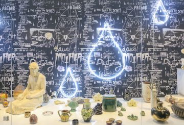
%20Gicleeprintson%20archivalgloss.jpg) Samantha Edwards, 9 Cudgee Rd, 2006.
Samantha Edwards, 9 Cudgee Rd, 2006.Giclee print on archival gloss.
Courtesy MOP and the artist.
The exhibition Shelf Life at MOP [where did the “Projects” go?] has an audio component that’s not as obvious as it should be. Listen with us for a second and maybe you can hear it… No? It’s the sound of a long bow being drawn, to wit:
“The ‘shelf life’ of a product refers to the amount of time it can be stored before it spoils or becomes obsolete. Generally the ‘shelf’ in question is a retail space allotted for the display of consumer goods. Shelves, then, are temporal zones that see items coming and going according to highs and lows in consumer demand: when we want the product it gets restocked, when we don’t, it goes to waste. These ideas provide a rich source of meaning for artists when the conventions of use and display, as it relates to art practice, are considered. Simply speaking: shelves speak to the things we collect, promote display and status, thereby elevating the very ‘thingness’ of our things. When, conversely, the whims of fashion, taste and novelty wear thin, that same shelved stuff lies dormant and abandoned, left to collect dust. As mnemonic devices, objects shelved are meaningful only because they’re attached to memories that risk being eventually forgotten. And forgotten is what often happens to objects filed away, shelved out of sight. As an exhibition featuring new work by eleven contemporary artists, Shelf Life engages with the lives of shelves, the shelves of life, life on the shelf, shelf life.”
Ahem. We spend quite a lot of time in supermarkets looking for obscure items, but it never occurred to us to look at the shelf as a mnemonic device that reveals the “thingness of things”. [Attention Martin Heidegger, clean up in aisle 4!] Dr. Daniel Mudie Cunningham, curator, has fashioned a very handsome group show of artists whose work might, in one way or another, illustrate this bold and overlooked curatorial gambit. We are certainly happy to consider even the most way out and wackiest curatorial ideas, but the work in Shelf Life is more a bargain bin of odds and sods than a coherent statement. While some artists make work that literally sits on shelves – Lionel Bawden, and Sarah Goffman for example – others are far more oblique, playing off the tangential implications of the title. So we get old work by Adam Cullen – a book he scribbled in when he was a kid, Elvis Richardson’s creepy Canberra murder case, Prudence Murphy’s photos of toy soldiers in a bathtub, Drew Bickford’s watercolours pickled baby in a jar, Cash Brown’s mutants, Kurt Schranzer‘s mechanical anuses and Samantha Edwards photos of stuff on shelves… We defy anyone to walk into this show and understand the connections without using the preposterous catalogue essays as a road map. Dr. Jacqueline Millner, another academic with a few hundred words up her sleeve, makes this observation:
“the comparison between [the art market] trade in objects of cultural value and everyday perishables, between the supermarket and the museum display case, is inescapable. So is the underpinning capitalist imperative of the shelf life; it exists to protect the manufacturer, providing a strictly limited guarantee of quality, after whose expiration the buyer takes all risk.”
And there we were thinking use-by dates were there to protect the consumer from spoiled and rotten produce. Makes you wonder how long such lame cultural studies speak has been sitting on the back of the shelf – it stinks. But the far more troubling thing here – and something that is becoming a real bug bear for us – is the number of times we come across half-arsed usage of Marx’s critique of political economy. How many more times must we struggle through catalogue essays with writers dropping in knowing references to “use value” and “ exchange value” with nary an acknowledgment of the contentious complexity of such terminology?
Reading the recent 100th issue of Frieze magazine, we found a discussion between art writers and critics that observed that all too often in art criticism today the tendency is to review the curator and the theme while actually leaving out whatever individual appeal certain art works might have. Shelf Life is a prime example of a show that, despite its hare brained curatorial theme, brings together some pretty decent work. The pity is it’s buried under a mountain of bullshit.